Sometimes, we wish to communicate spatial and temporal information collectively through visualisation. This can be achieved through several graphical displays: one can make faceted maps across time, creating map animations, or constructing interactive graphics to link between map and time series plot. While interactive graphics will be the main focus of vignette 6. Interactive graphics, this vignette will introduce a specific type of spatio-temporal plot called glyph maps.
Understanding glyph maps
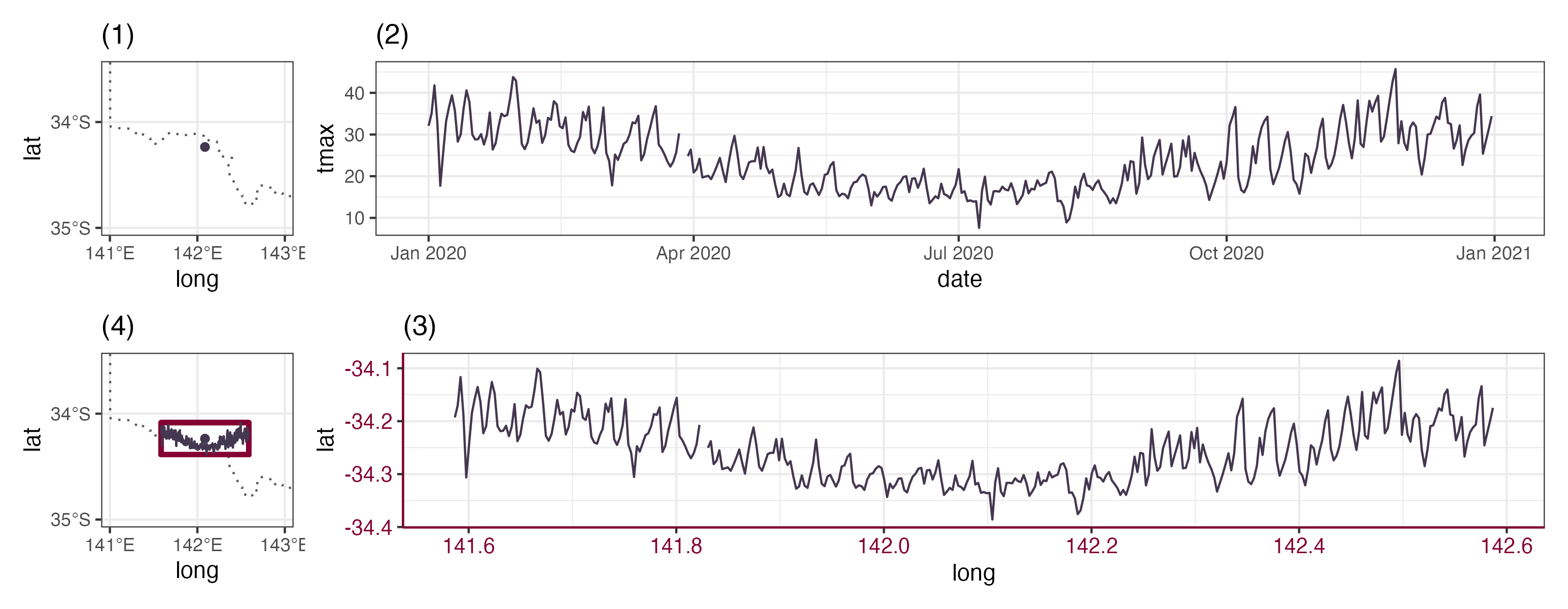
The concept of glyph maps was initially proposed in Wickham et al. (2012). The underlying idea is to transform the temporal coordinates into spatial coordinates so that time series plot can be displayed on the map. The diagram below illustrates how the coordinate transformation:

Subplot (1) show the spatial location of a weather station and
subplot (2) displays its associated maximum temperature as time series
in 2020. In subplot (3), the temporal coordinates are transformed into
the spatial coordinates using linear algebra with a defined
height and width (Equation 1 in Wickham et al. (2012)), while the time series
glyph remains unchanged. The transformed time series can then be plotted
as a layer on the map in (4).
The package GGally initially implement the glyph map. It
uses glyphs() to calculate the axis transformation and then
uses geom_polygon() to draw the map. In cubble, a ggproto
implementation geom_glyph() performs the linear algebra
internally as data transformation . The geom_glyph()
requires four aesthetics: x_major, y_major,
x_minor, and y_minor. The major axes are the
outer spatial coordinates and the minor axes are the inner/ temporal
coordinates:
data |>
  ggplot() +
  geom_glyph(aes(x_major = ..., x_minor = ..., y_major = ..., y_minor = ...))
Reference line and box can be added by separate geoms
(geom_glyph_box(), geom_glyph_line()) with the
same aesthetics (x_major, x_minor, y_major, y_minor). To
avoid repetition, you may want specify the aesthetics collectively
inside ggplot():
data |>
  ggplot(aes(x_major = ..., x_minor = ..., y_major = ..., y_minor = ...)) +
  geom_glyph_box() +
  geom_glyph_line() +
  geom_glyph()
If you want add an undelying map which does not use the four glyph
map aesthetics, the argument inherit.aes = FALSE is
handy:
data |>
  ggplot(aes(x_major = ..., x_minor = ..., y_major = ..., y_minor = ...)) +
  geom_sf(data = MAP_DATA, inherit.aes = FALSE)
  geom_glyph_box() +
  geom_glyph_line() +
  geom_glyph()
Monthly average maximum temperature in Victoria, Australia
Global Historical Climatology Network (GHCN) provides daily climate
measures from stations across the world. The dataset
climate_aus stores climate variables (precipitation,
maximum and minimum temperature) for 639 Australian stations in 2020.
This is a lot of stations to work with and we will start with a randomly
sample 80 stations (since not all the stations have the full year
record, we will only consider those that have 366 days for 2020):
set.seed(12345)
(tmax <- climate_aus |>
    rowwise() |>
    filter(nrow(ts) == 366) |>
    slice_sample(n = 80))
#> # cubble:   key: id [80], index: date, nested form
#> # spatial:  [114.7, -43.66, 153.64, -11.15], Missing CRS!
#> # temporal: date [date], prcp [dbl], tmax [dbl], tmin [dbl]
#>    id           long   lat  elev name                        wmo_id ts
#>    <chr>       <dbl> <dbl> <dbl> <chr>                        <dbl> <list>
#>  1 ASN00014829  131. -18.3 316.  lajamanu                     94231 <tibble>
#>  2 ASN00009131  115. -30.3   1.6 jurien bay                   95600 <tibble>
#>  3 ASN00024048  141. -34.2  31.5 renmark aero                 95687 <tibble>
#>  4 ASN00096071  146. -42.1 742   lake st clair national park  94976 <tibble>
#>  5 ASN00093053  147. -42.0 186   ross (the boulevards)        94985 <tibble>
#>  6 ASN00048027  146. -31.5 260   cobar mo                     94711 <tibble>
#>  7 ASN00023885  139. -35.2  55   noarlunga                    94808 <tibble>
#>  8 ASN00010286  117. -31.6 217.  cunderdin airfield           95625 <tibble>
#>  9 ASN00009964  117. -34.6 250   rocky gully                  94631 <tibble>
#> 10 ASN00008051  115. -28.8  33   geraldton airport            94403 <tibble>
#> # ℹ 70 more rows
Next, we would like to summarise the daily maximum temperature into
monthly. This can be done with the dplyr group_by +
summarise:
(tmax <- tmax |>
  face_temporal() |>
  group_by(month = tsibble::yearmonth(date)) |>
  summarise(tmax = mean(tmax, na.rm = TRUE)))
#> # cubble:   key: id [80], index: month, long form, groups: month [12]
#> # temporal: 2020 Jan -- 2020 Dec [1M], no gaps
#> # spatial:  long [dbl], lat [dbl], elev [dbl], name [chr], wmo_id [dbl]
#>       month id           tmax
#>       <mth> <chr>       <dbl>
#>  1 2020 Jan ASN00001018  33.5
#>  2 2020 Jan ASN00002012  37.0
#>  3 2020 Jan ASN00003030  34.0
#>  4 2020 Jan ASN00003032  34.9
#>  5 2020 Jan ASN00003057  33.5
#>  6 2020 Jan ASN00004028  36.9
#>  7 2020 Jan ASN00007600  37.6
#>  8 2020 Jan ASN00008051  31.0
#>  9 2020 Jan ASN00008137  35.0
#> 10 2020 Jan ASN00009037  34.3
#> # ℹ 950 more rows
One requirement for the data to be plot with ggplot2 is that all the
variables mapped to aesthetics need to be store in the same table. In
cubble, you can move the spatial variables (e.g. long and
lat) into the temporal cubble with
unfold():
(tmax <- tmax |> unfold(long, lat))
#> # cubble:   key: id [80], index: month, long form
#> # temporal: 2020 Jan -- 2020 Dec [1M], no gaps
#> # spatial:  long [dbl], lat [dbl], elev [dbl], name [chr], wmo_id [dbl]
#>       month id           tmax  long   lat
#>       <mth> <chr>       <dbl> <dbl> <dbl>
#>  1 2020 Jan ASN00001018  33.5  126. -16.4
#>  2 2020 Jan ASN00002012  37.0  128. -18.2
#>  3 2020 Jan ASN00003030  34.0  122. -18.7
#>  4 2020 Jan ASN00003032  34.9  124. -17.4
#>  5 2020 Jan ASN00003057  33.5  123. -16.5
#>  6 2020 Jan ASN00004028  36.9  120. -20.1
#>  7 2020 Jan ASN00007600  37.6  118. -28.1
#>  8 2020 Jan ASN00008051  31.0  115. -28.8
#>  9 2020 Jan ASN00008137  35.0  117. -30.9
#> 10 2020 Jan ASN00009037  34.3  116. -30.3
#> # ℹ 950 more rows
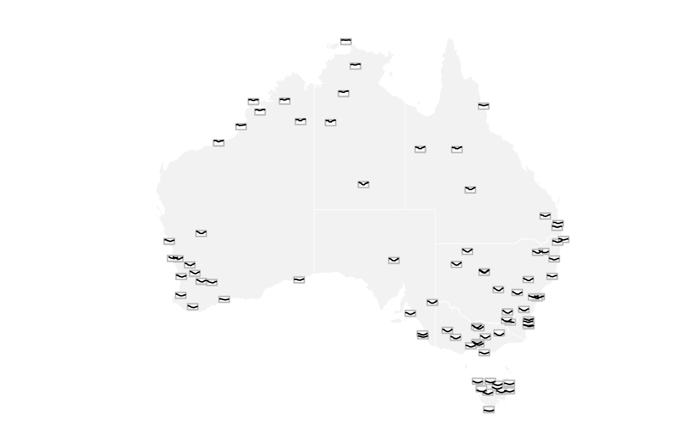
Using the glyph map syntax introduced in this vignette, we can then create a glyph map:
tmax |>
  ggplot(aes(x_major = long, y_major = lat,
             x_minor = month, y_minor = tmax))  +
  geom_sf(data = ozmaps::abs_ste,
          fill = "grey95", color = "white",
          inherit.aes = FALSE) +
  geom_glyph_box(width = 1, height = 0.5) +
  geom_glyph(width = 1,  height = 0.5) +
  coord_sf(xlim = c(110, 155)) +
  theme_void() +
  theme(legend.position = "bottom") +
  labs(x = "Longitude", y = "Latitude")