H. Sherry Zhang Department of Statistics and Data Sciences University of Texas at Austin
Get the repository for today: library(usethis) create_from_github("SDS322E-26FALL/0501-join", fork = FALSE)
Learning objectives
Join multiple data frames together for exploratory data analysis
joins: left_join(), right_join(), inner_join(), full_join(), semi_join(), and anti_join()
revision: filter(), mutate(), %in%
new: fct_recode(), tibble()
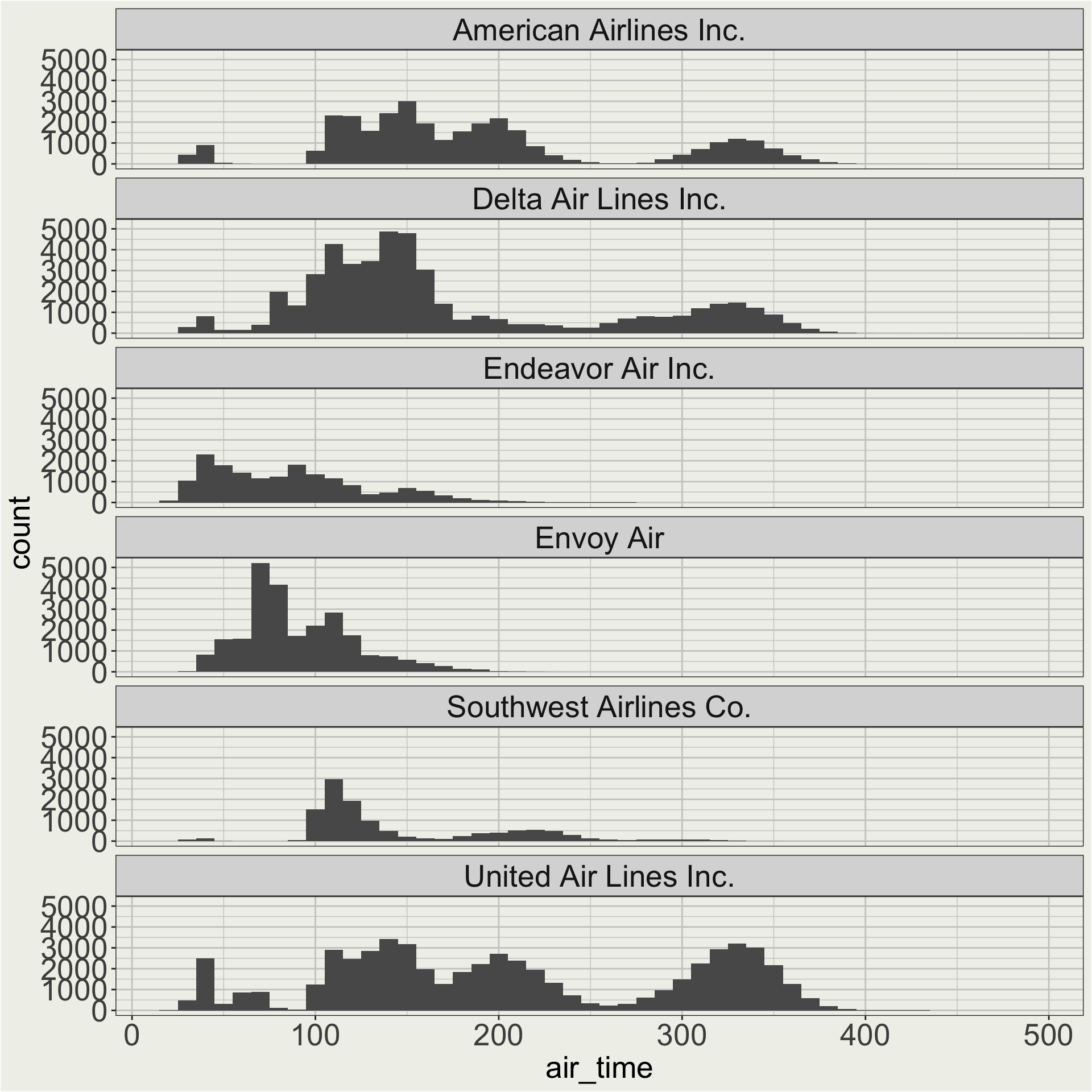
Application 1a: distribution of air time of flights
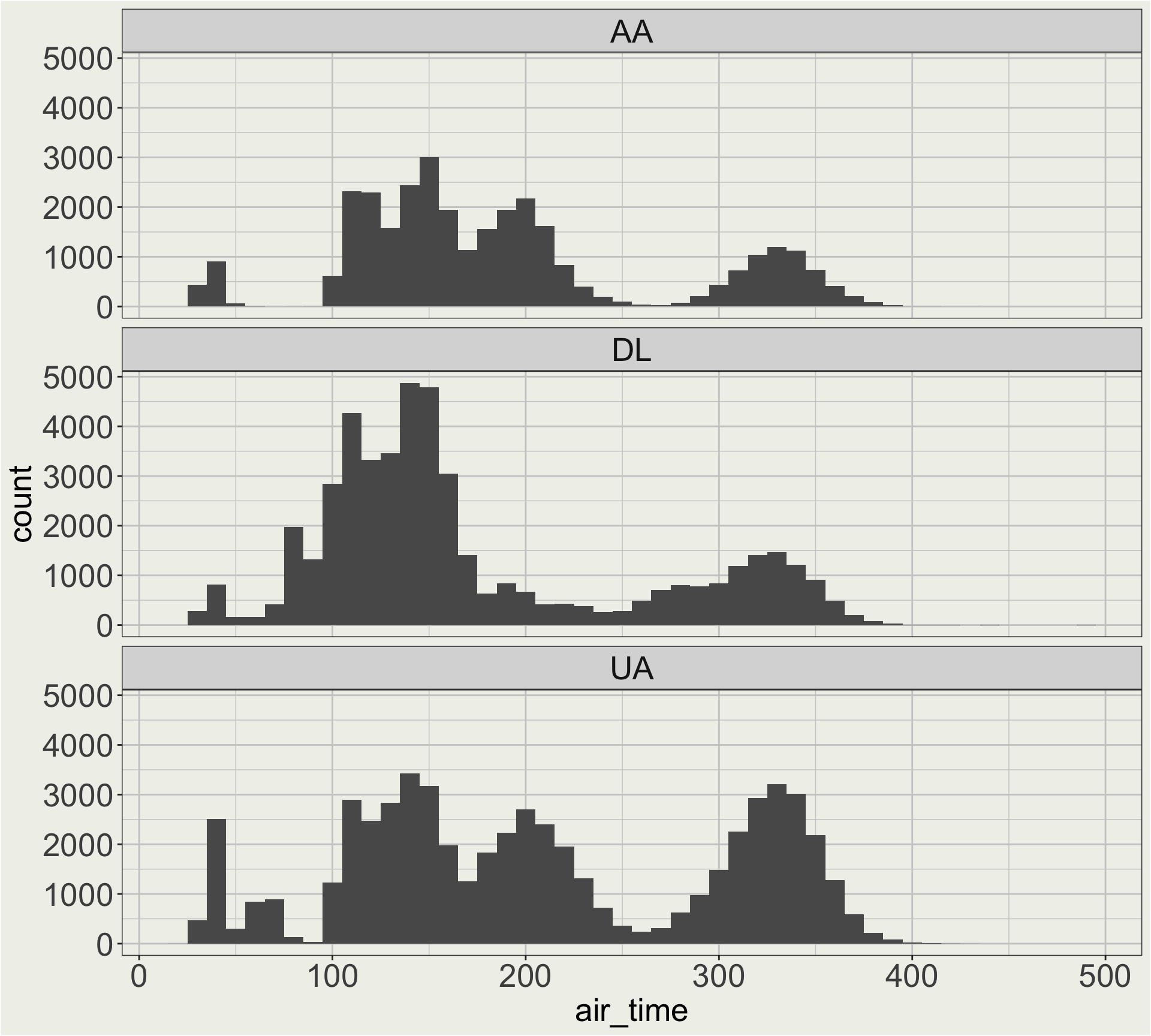
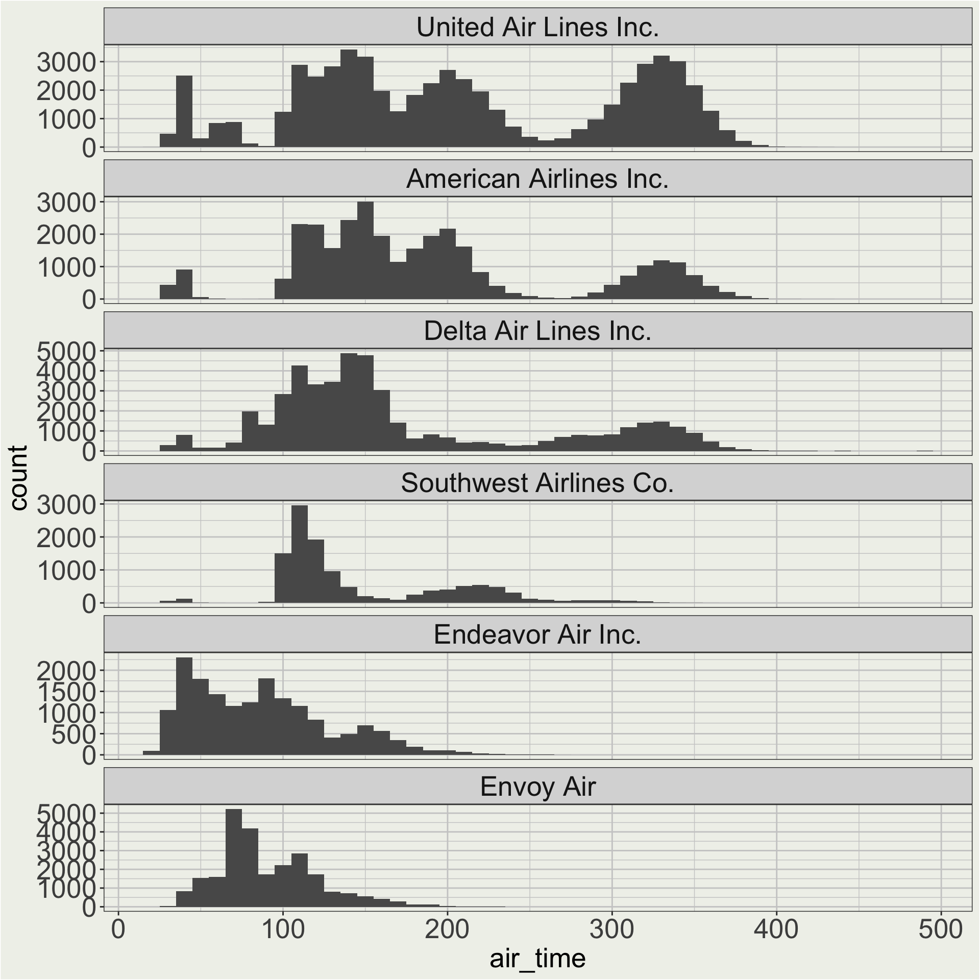
How does the distribution of air time vary by carrier?
flights |># we looked in the air_time vs. distance plot# before the there are long flights # thqt go to HNL (Hawaii)filter(dest !="HNL") |>filter(carrier %in%c("AA", "DL", "UA")) |>ggplot(aes(x = air_time)) +geom_histogram(binwidth =10) +facet_wrap(vars(carrier), ncol =1)
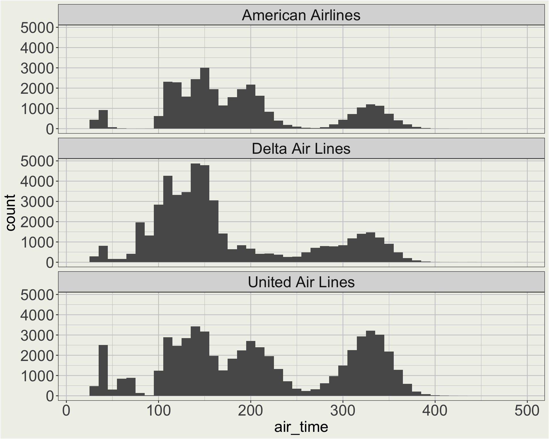
Maybe I want a better facet header than “AA”, “DL”, and “UA”. 🤔
Application 1a: use fct_recode to recode carrier names
I didn’t give you can example on fct_recode(), but here you go.
flights |># we looked in the air_time vs. distance plot# before the there are long flights # thqt go to HNL (Hawaii)filter(dest !="HNL") |>filter(carrier %in%c("AA", "DL", "UA")) |>mutate(carrier =fct_recode( carrier, "American Airlines"="AA", "Delta Air Lines"="DL", "United Air Lines"="UA")) |>ggplot(aes(x = air_time)) +geom_histogram(binwidth =10) +facet_wrap(vars(carrier), ncol =1)
Application 1b: distribution of air time of flights
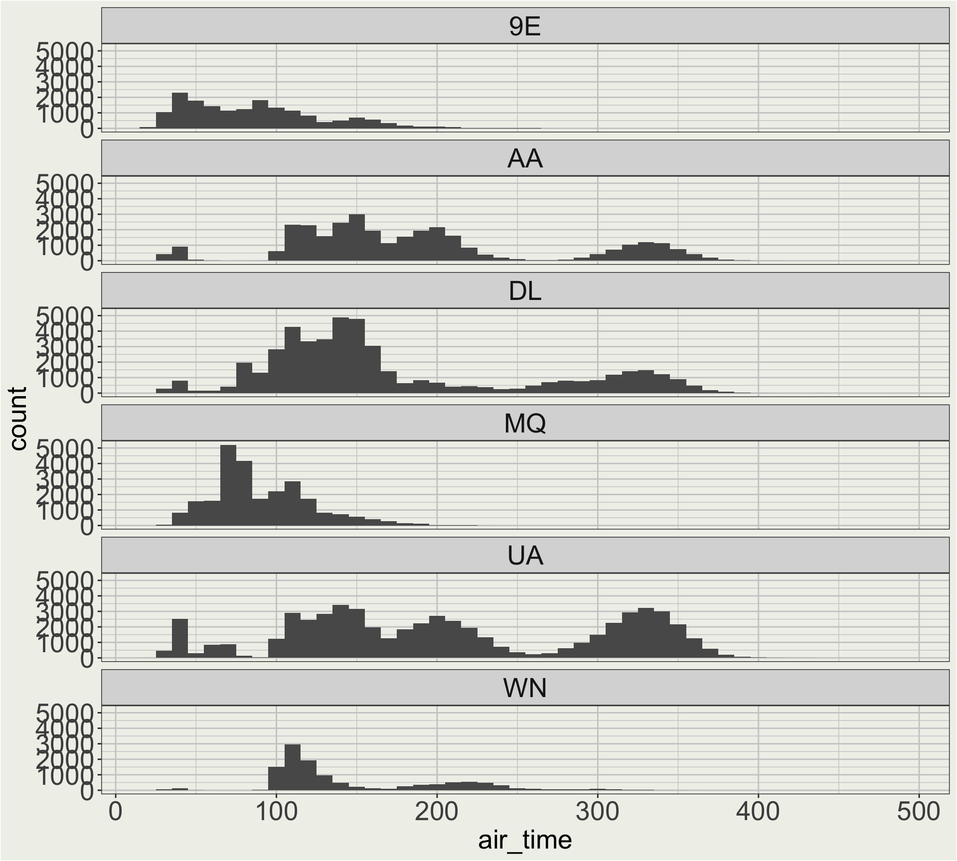
When we have more carriers, manually recoding all the airlines can be tedious. 🤔
# A tibble: 5 × 2
  carrier name
  <chr>   <chr>
1 9E      Endeavor Air Inc.
2 AA      American Airlines Inc.
3 AS      Alaska Airlines Inc.
4 B6      JetBlue Airways
5 DL      Delta Air Lines Inc.
What if I want the airline to come in the order of main stream airlines (AA, DL, UA) first and then regionals (MQ, WN, 9E)?
Different types of join
Mutate join
Left join: left_join()
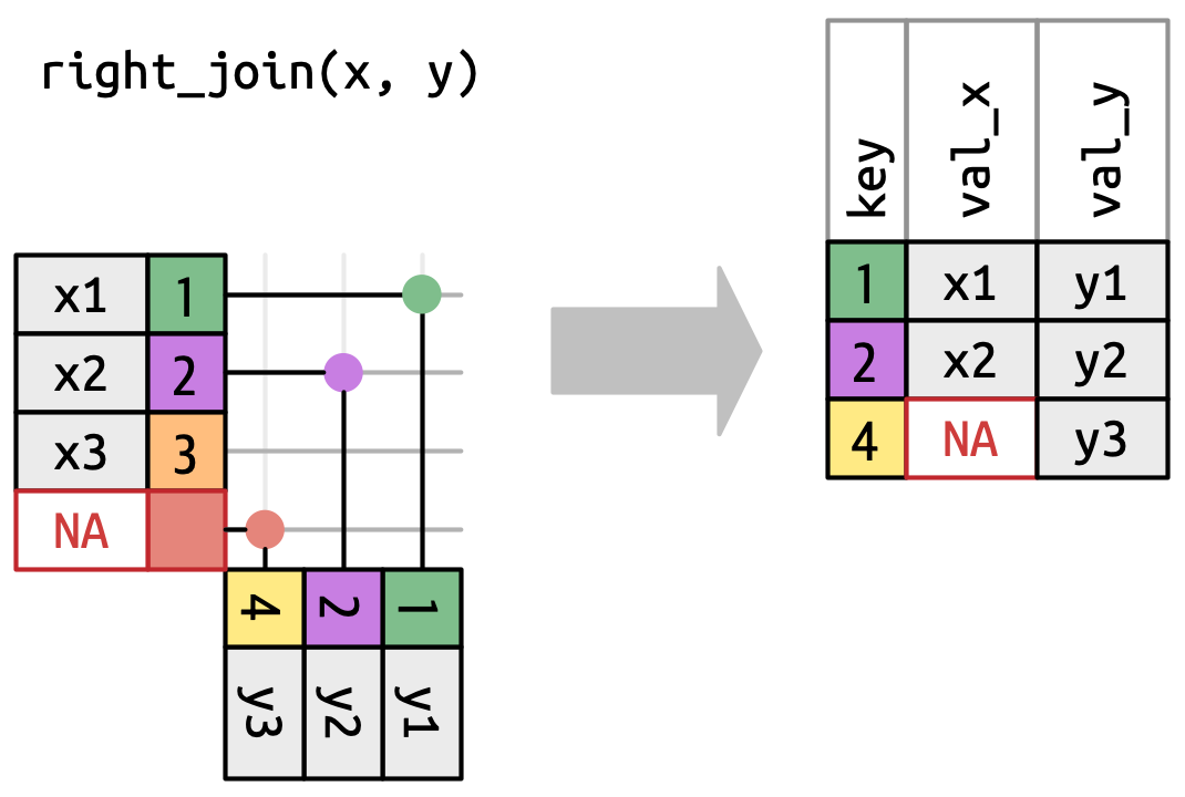
Right join: right_join()
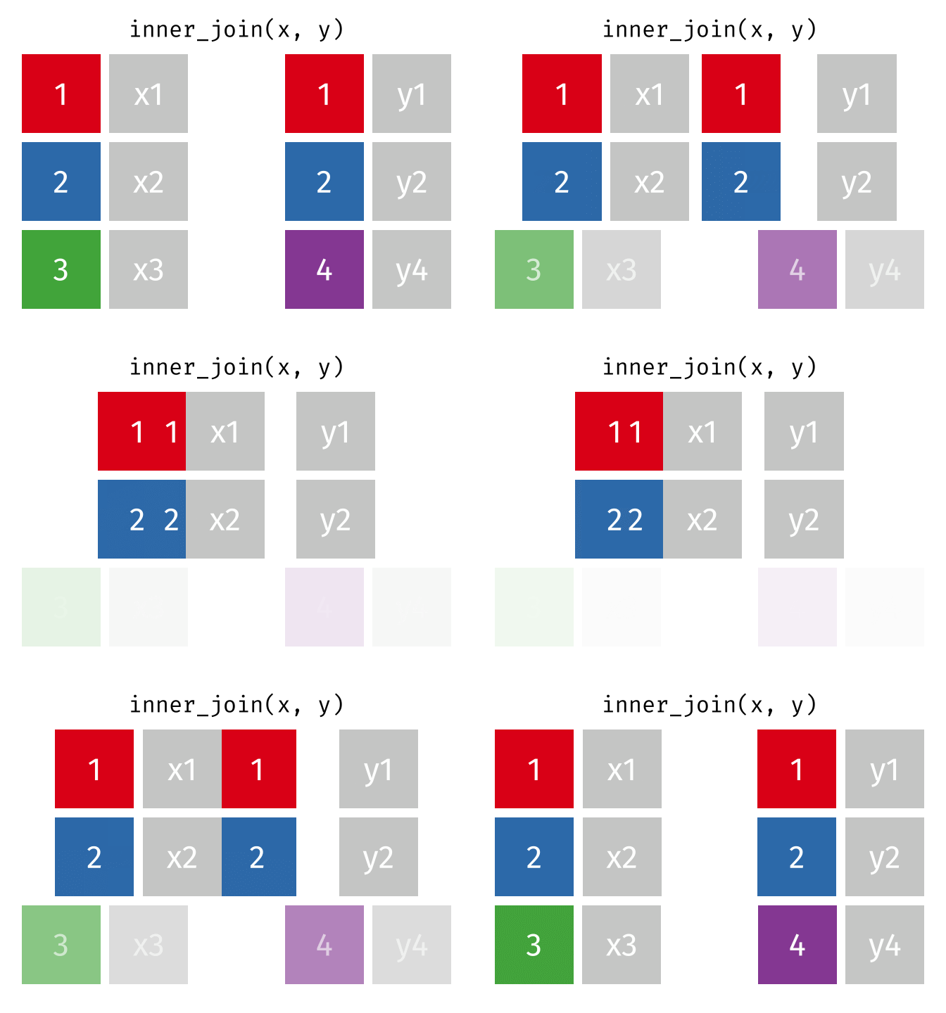
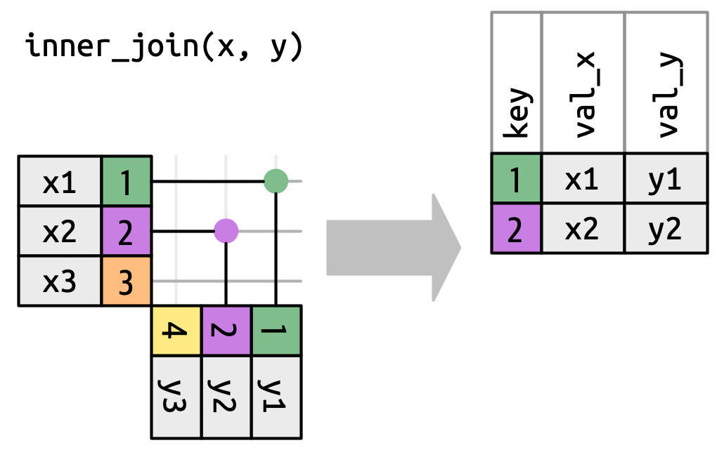
Inner join: inner_join()
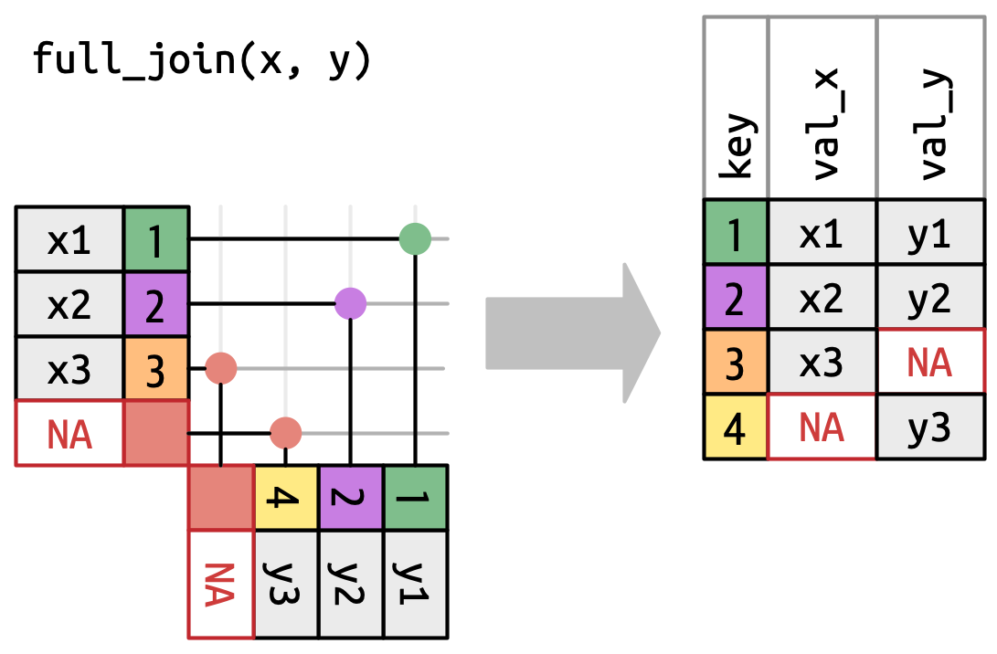
Full join: full_join()
Filter join
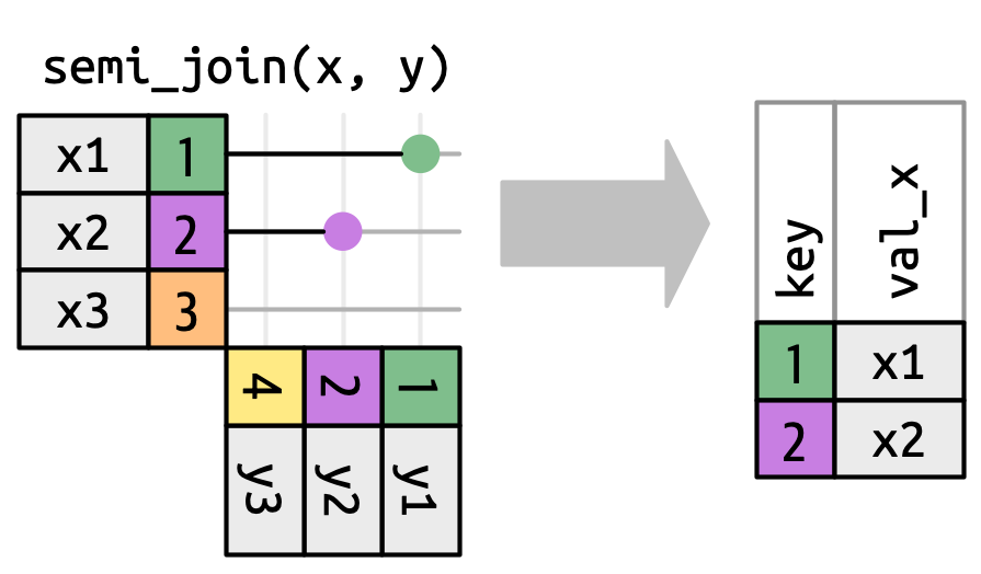
Semi join: semi_join()
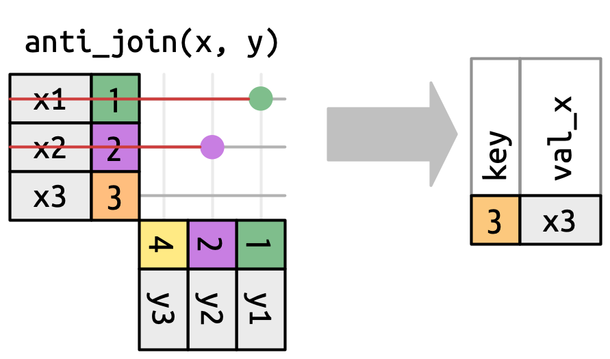
Anti join: anti_join()
Left join
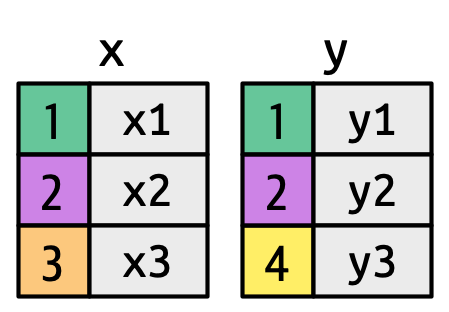
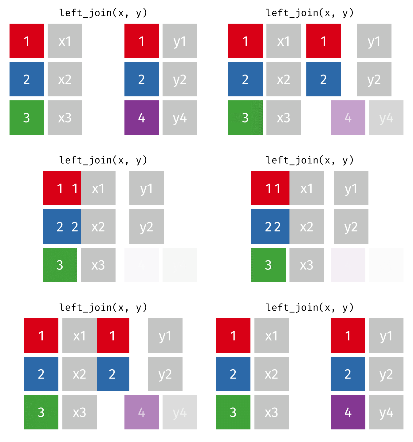
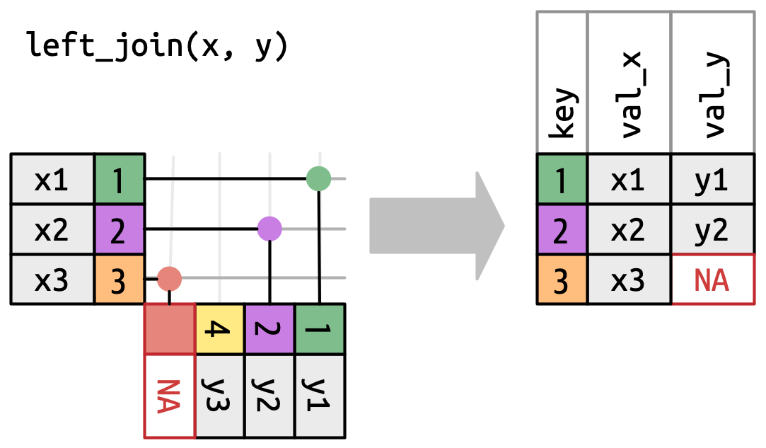
A left join keeps all observations in data frame x. Every row of x is preserved in the output and NA is used if there is no matching value in data frame y.
Left join syntax (1/2)
left_join(DATA_X, DATA_Y, by = "SHARED_KEY")
df1 <-tibble(x =c(1, 2, 3), y =c("a", "b", "c") )df1
# A tibble: 3 × 2
      x y
  <dbl> <chr>
1     1 a
2     2 b
3     3 c