Elements of Data Science
SDS 322E
H. Sherry Zhang
Department of Statistics and Data Sciences
University of Texas at Austin
The viridis color palette
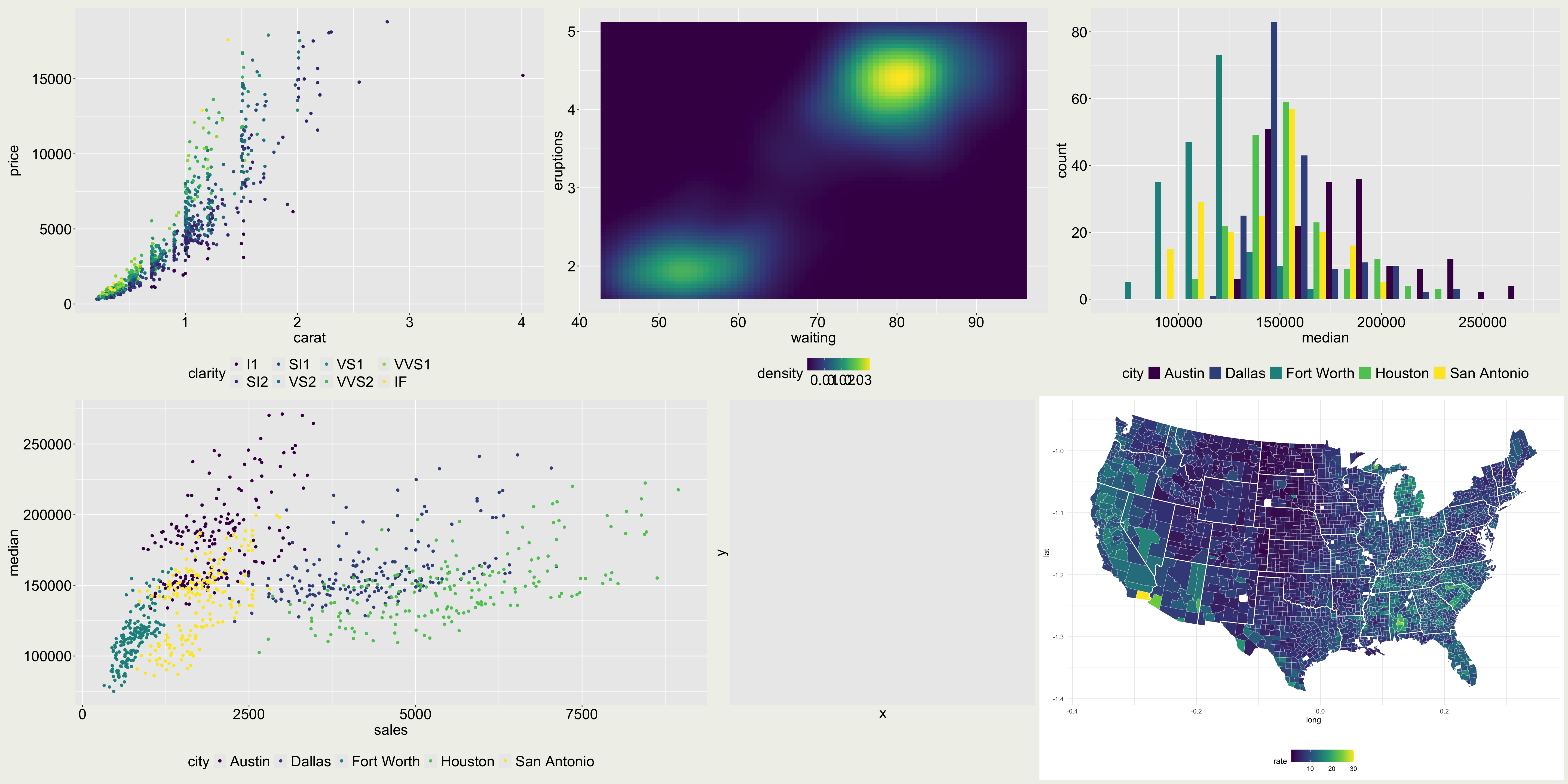
Why is viridis a good color palette?
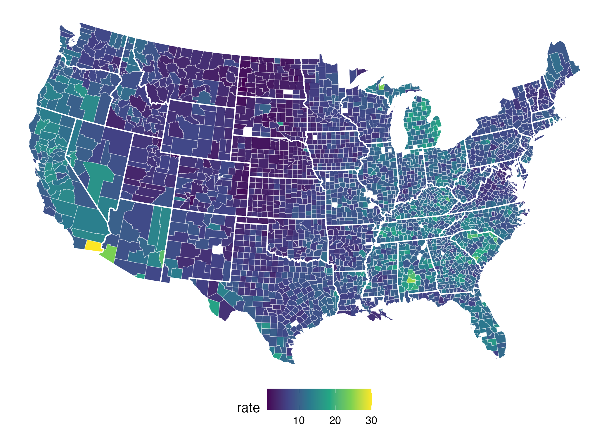
They are perceptually uniform: meaning that values close to each other have similar-appearing colors and values far away from each other have more different-appearing colors, consistently across the range of values.
They are robust to colorblindness, so that the above properties hold true for people with common forms of colorblindness, as well as in grey scale printing.
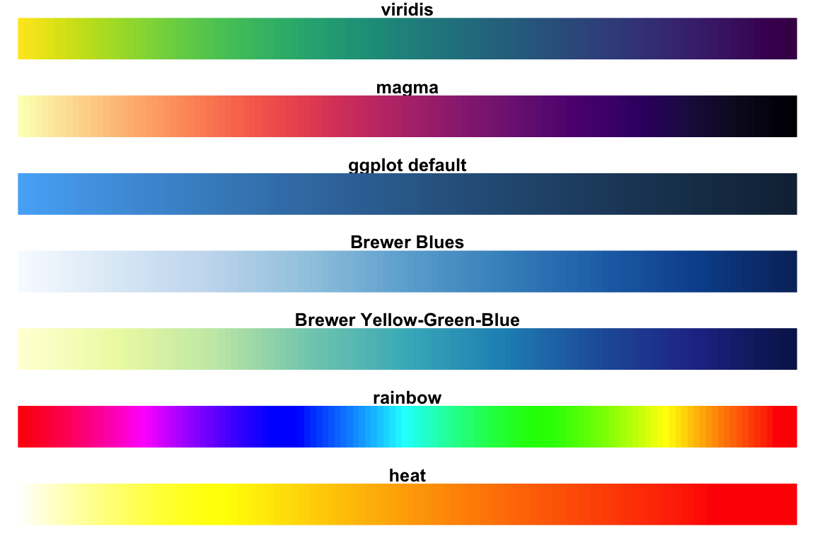
What about the rainbow palette?
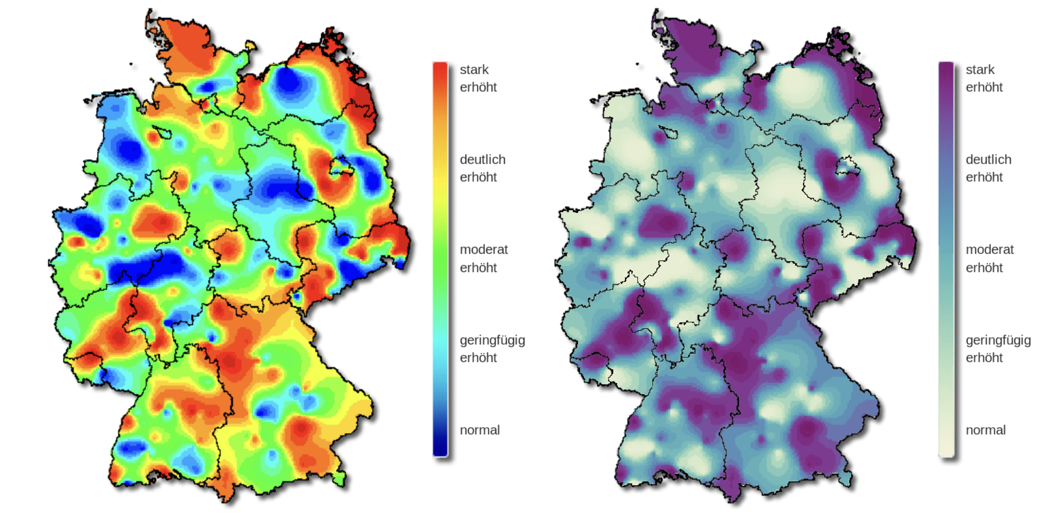
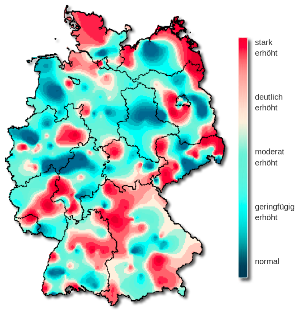
The rainbow palette is not uniformly perceived.
The severity of influenza in Germany in week 8, 2019.
The original color palette (left) is the classic rainbow ranging from “normal” (blue) to “strongly increased” (red).
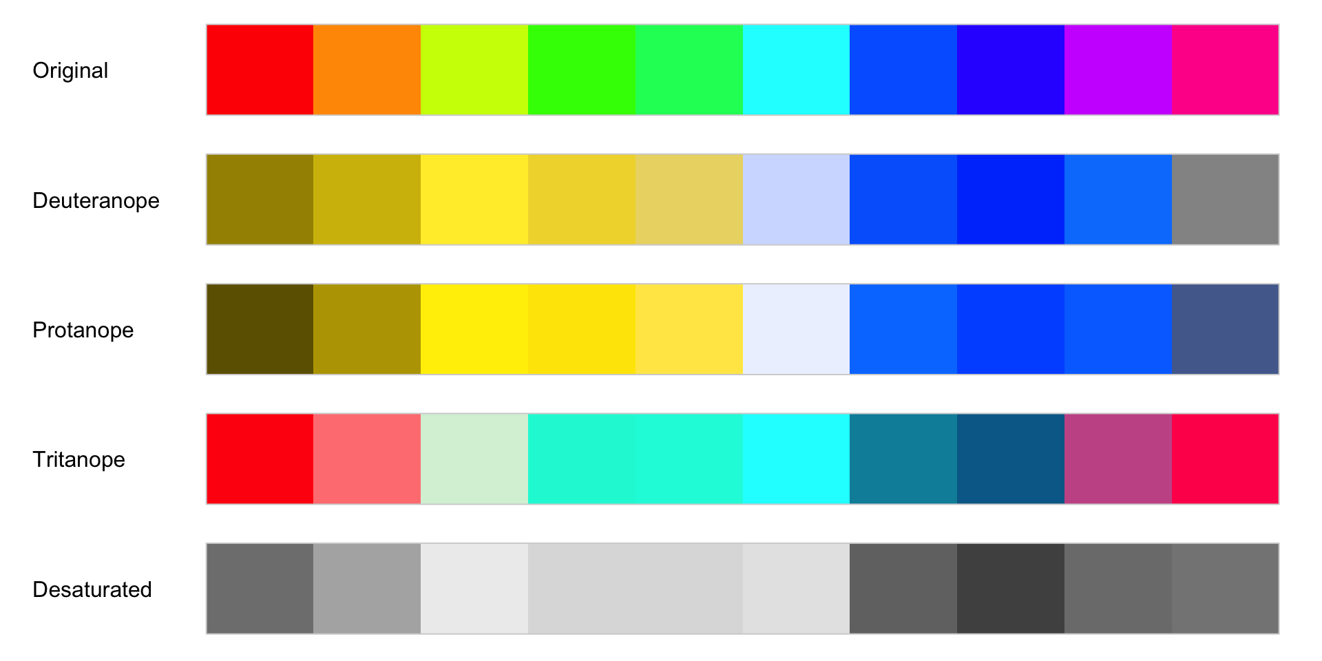
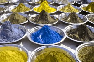
Color blindness
normal
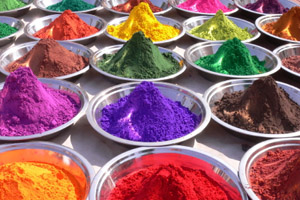
tritanopia: reduced sensitivity to blue light (extremely rare)
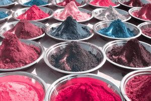
protanopia: reduced sensitivity to red light
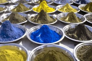
deuteranopia: reduced sensitivity to green light (most common)
What does that mean to a color palette?
The rainbow palette
The viridis palette
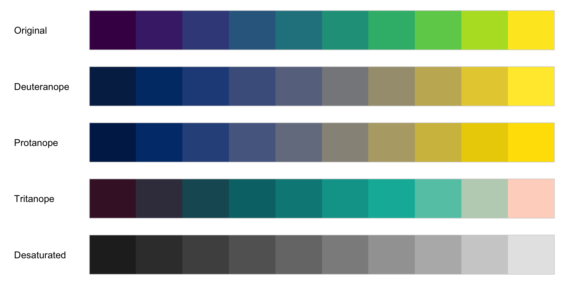
Color blindness affects about 8% of all males and 0.5% of all females!
What does that mean on the plot?
Normal
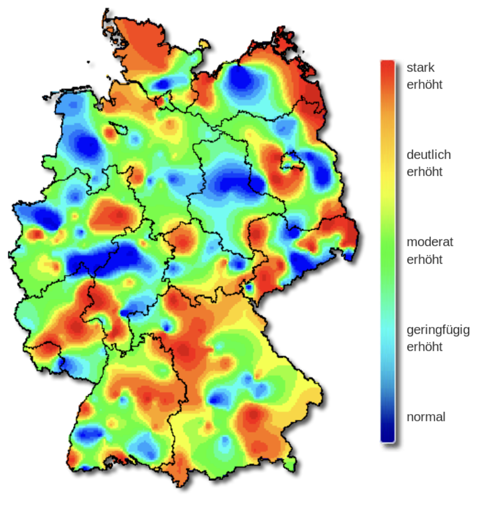
Deuteranopia
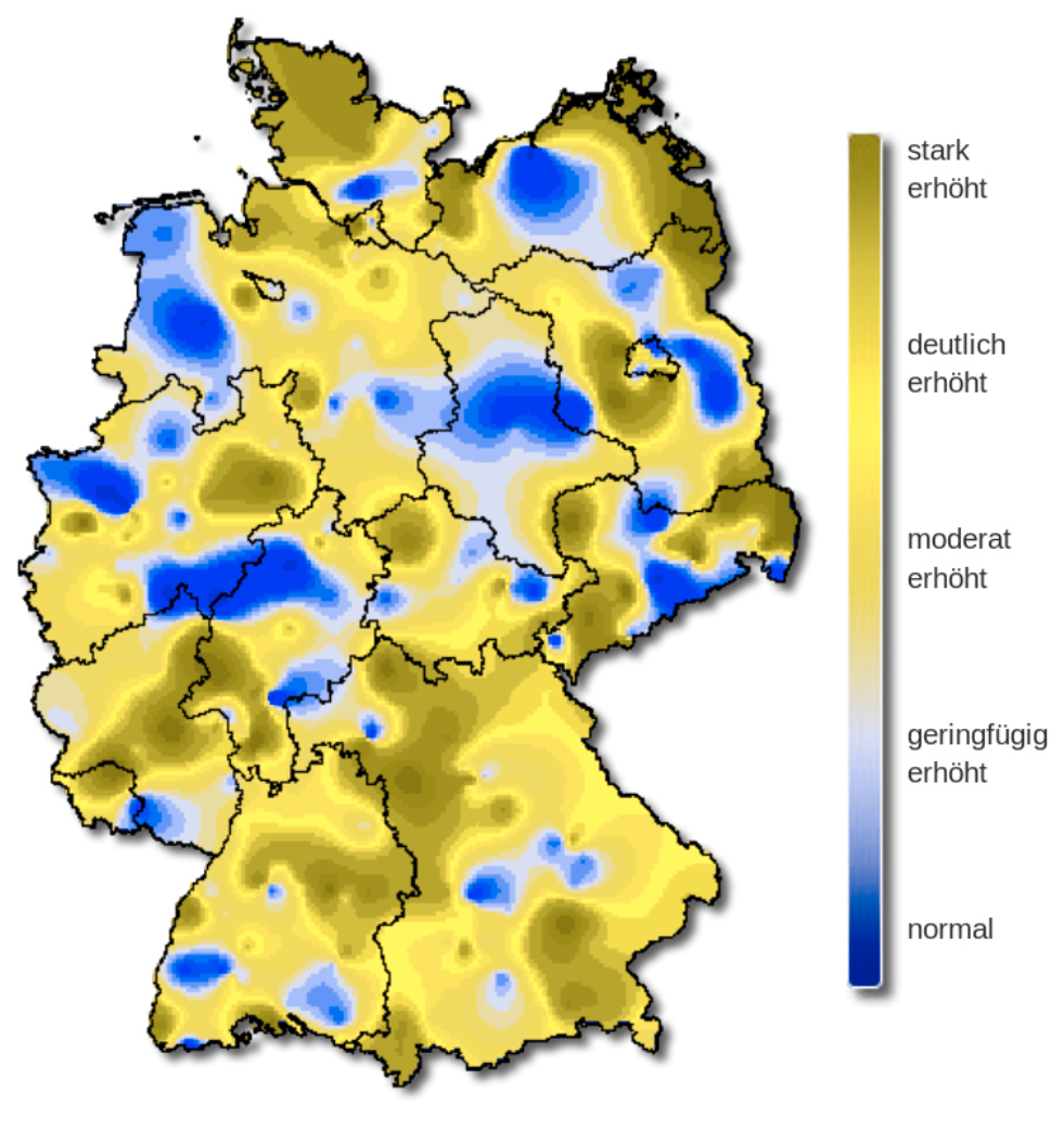
Protanopia
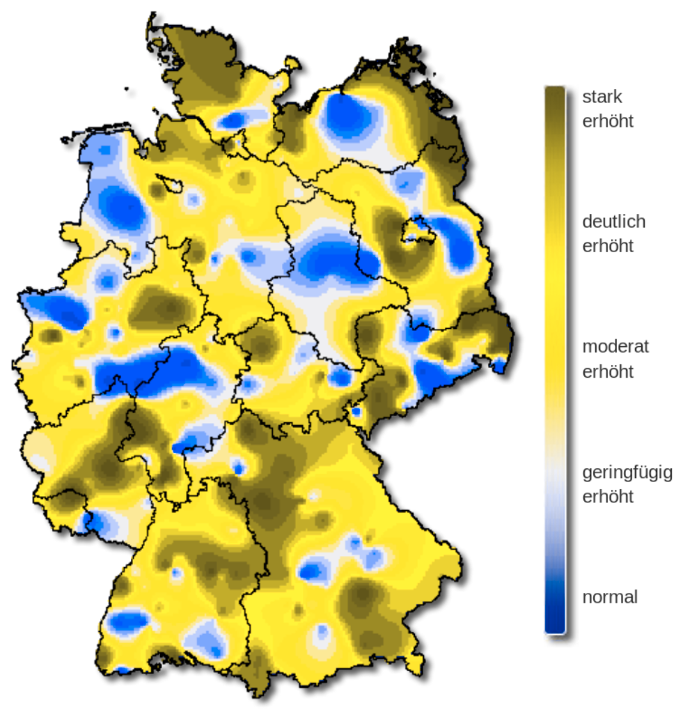
Tritanopia
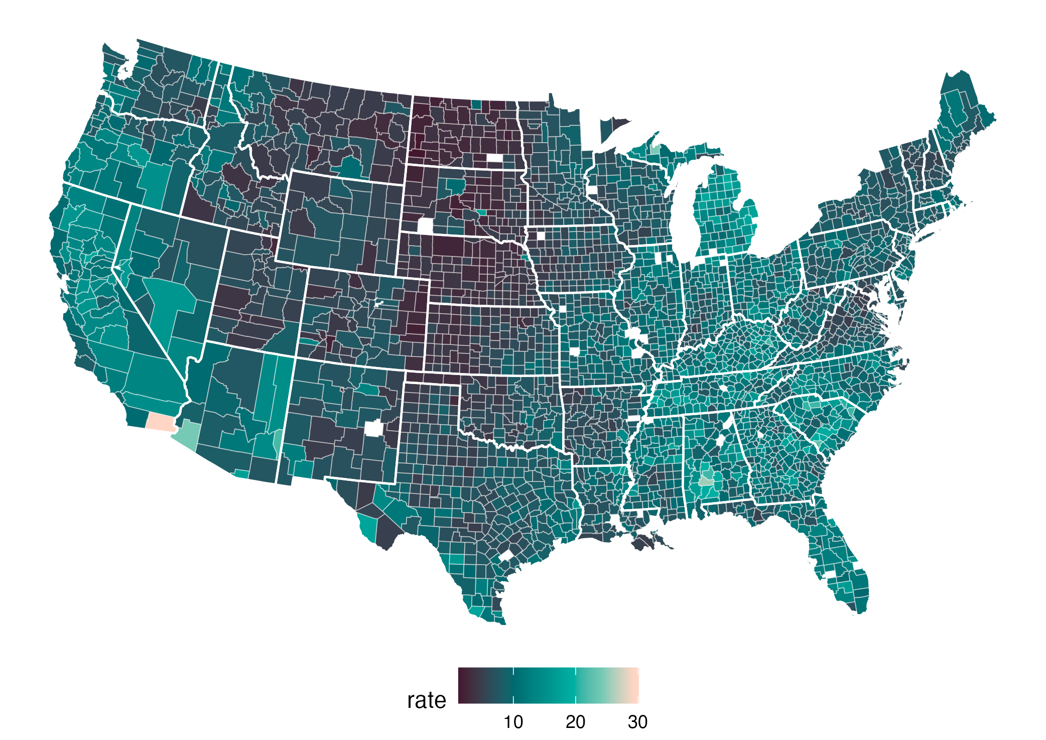
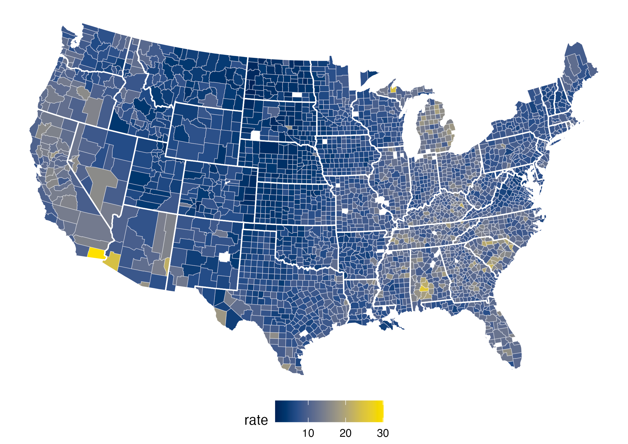
The rainbow color palette is also not color blind-friendly because baseline color (blue) gets emphasized with deuteranopia and protanopia.
What does that mean on the plot?
normal
tritanopia
protanopia
deuteranopia (most common)
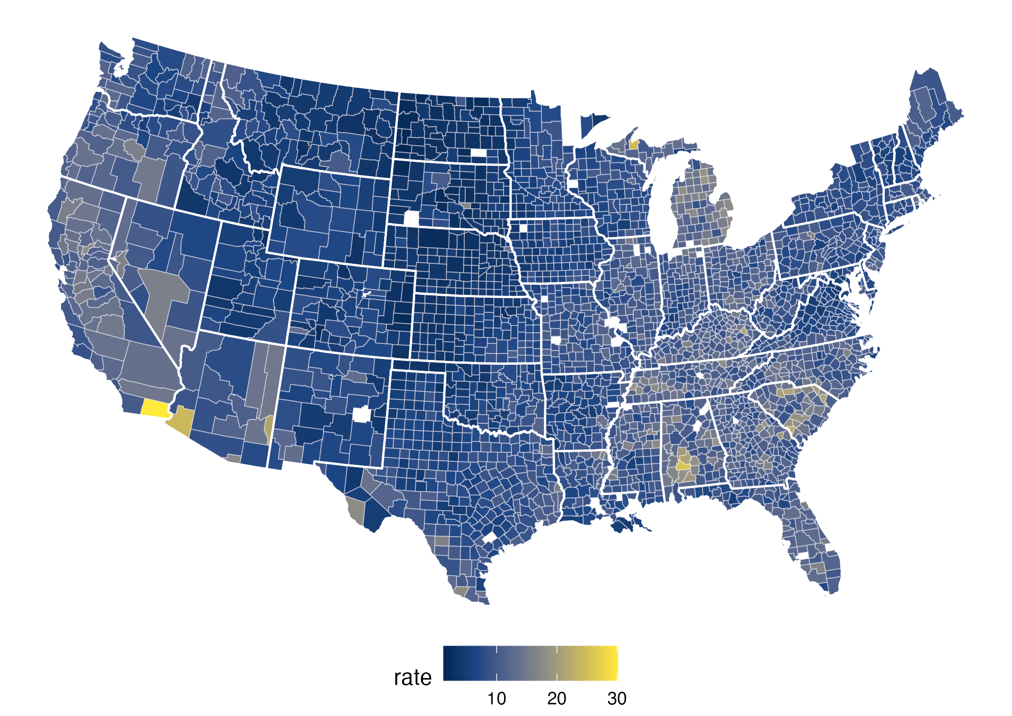
Good color platettes go beyond viridis
Three types of color schemes designed for different types of data:
Qualitative: for categorical information, i.e., where no particular ordering of categories is available and every color should receive the same perceptual weight.
Sequential: for ordered/numeric information, i.e., going from high to low (or vice versa).
Diverging: for ordered/numeric information around a central neutral value, i.e., where colors diverge from neutral to two extremes.

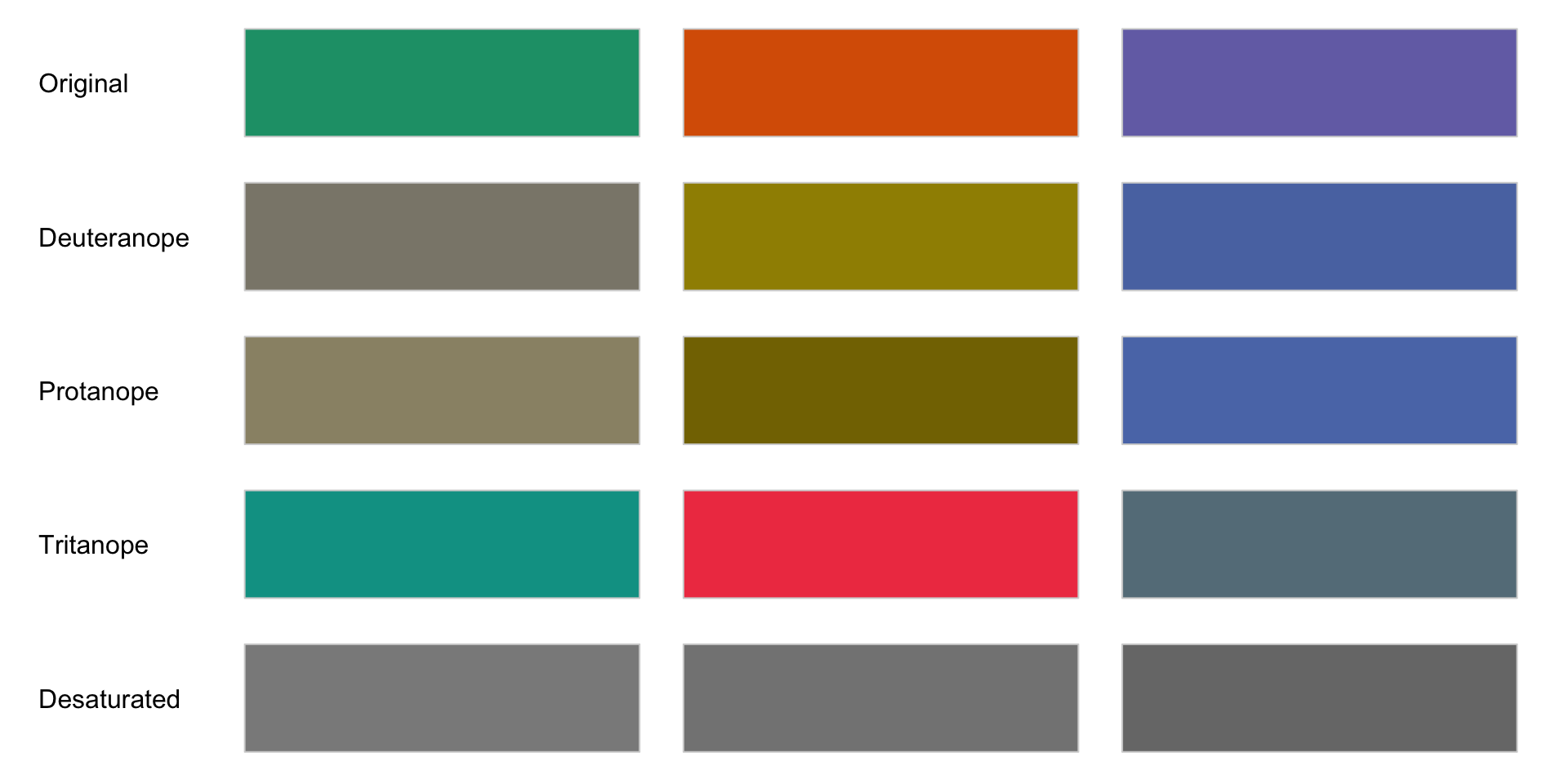
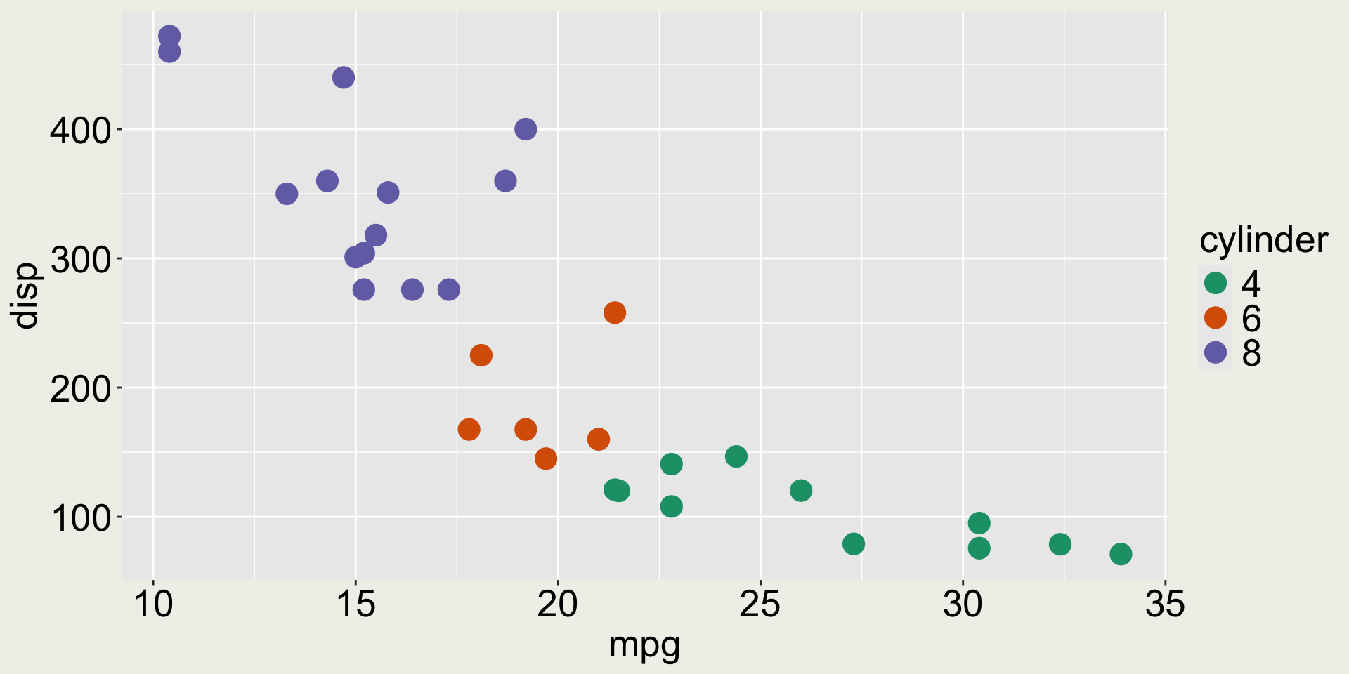
Qualitative color palette: Dark2
Qualitative color palette: Okabe-Ito
New package: ggthemes has many cute themes, scales, and geometries that worth checking out.
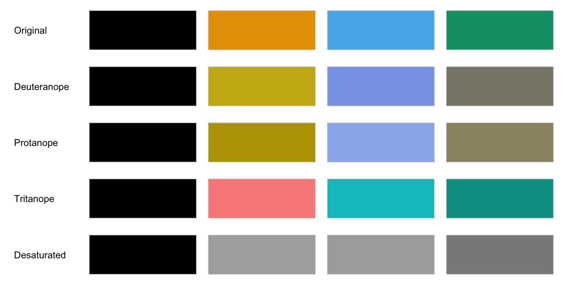
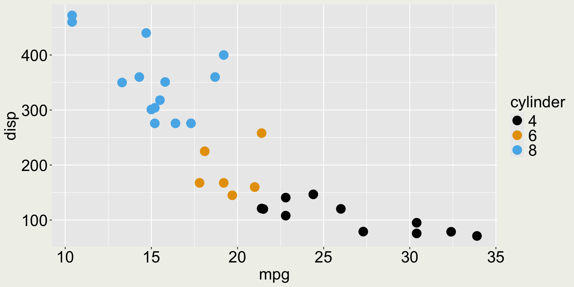
To use ggthemes, you need to install it first using install.packages("ggthemes") in the console, and then load it using library(ggthemes) in the script.
Your time
This is a plot I show you in week1 hello-world.pdf. Can you use the mtcars data with things you’ve learnt from ggplot2 to create the exact same plot?
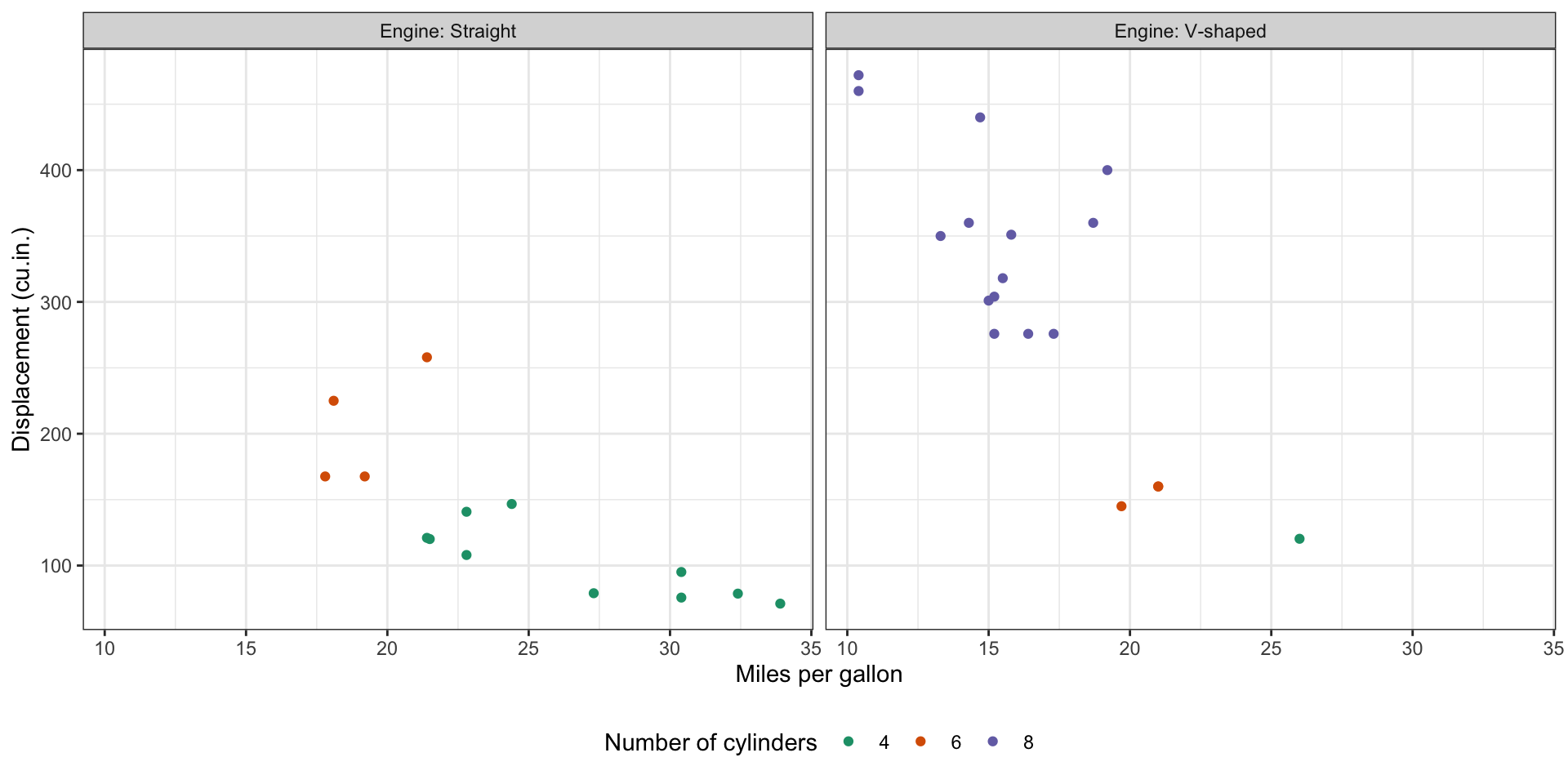
There are some hints in the next slides to guide you make this plot step-by-step.