H. Sherry Zhang Department of Statistics and Data Sciences The University of Texas at Austin
Fall 2025
Learning objectives
Expand your ggplot2 skills:
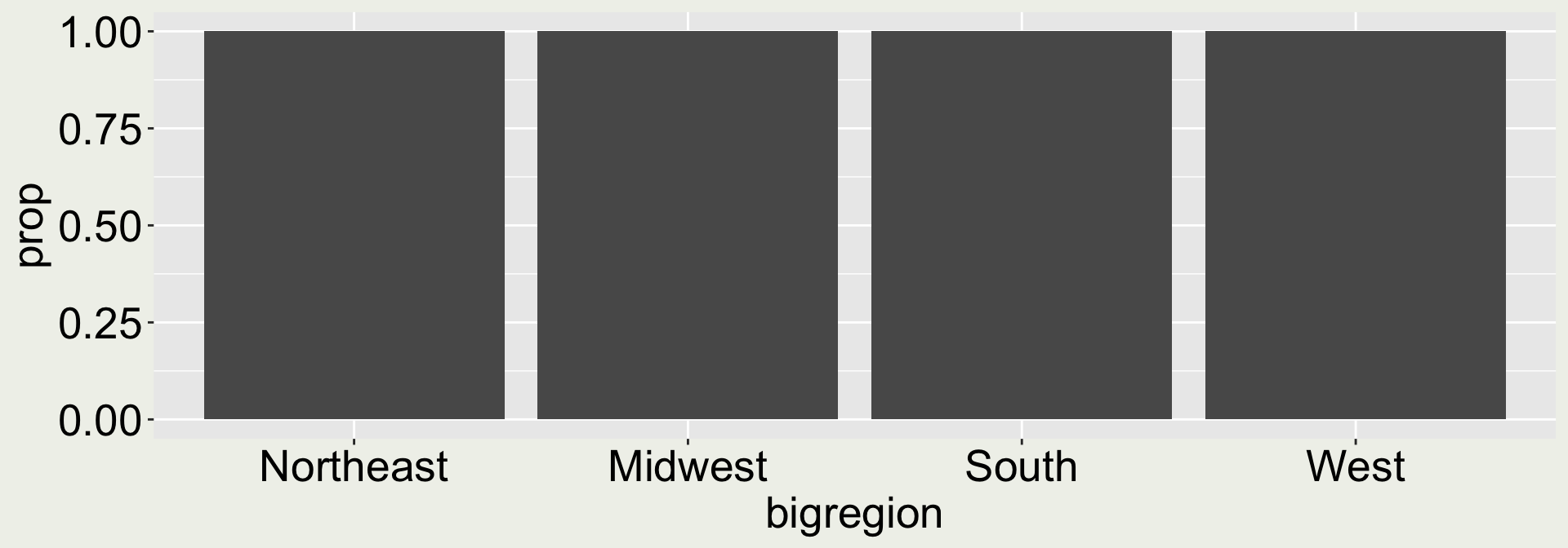
Create informative plots for displaying count and proportions (the gss example)
Identify and generate next steps when results are unexpected, recognizing that exploratory data analysis is an iterative process (the movie example)
Syntax wise:
New geometries: geom_bar(), geom_col(), geom_histogram()
The position argument in geom_bar()
The after_stat() syntax in geom_bar() and geom_histogram()
Arguments in the facet_wrap(): nrow, ncol, scales, and labeller
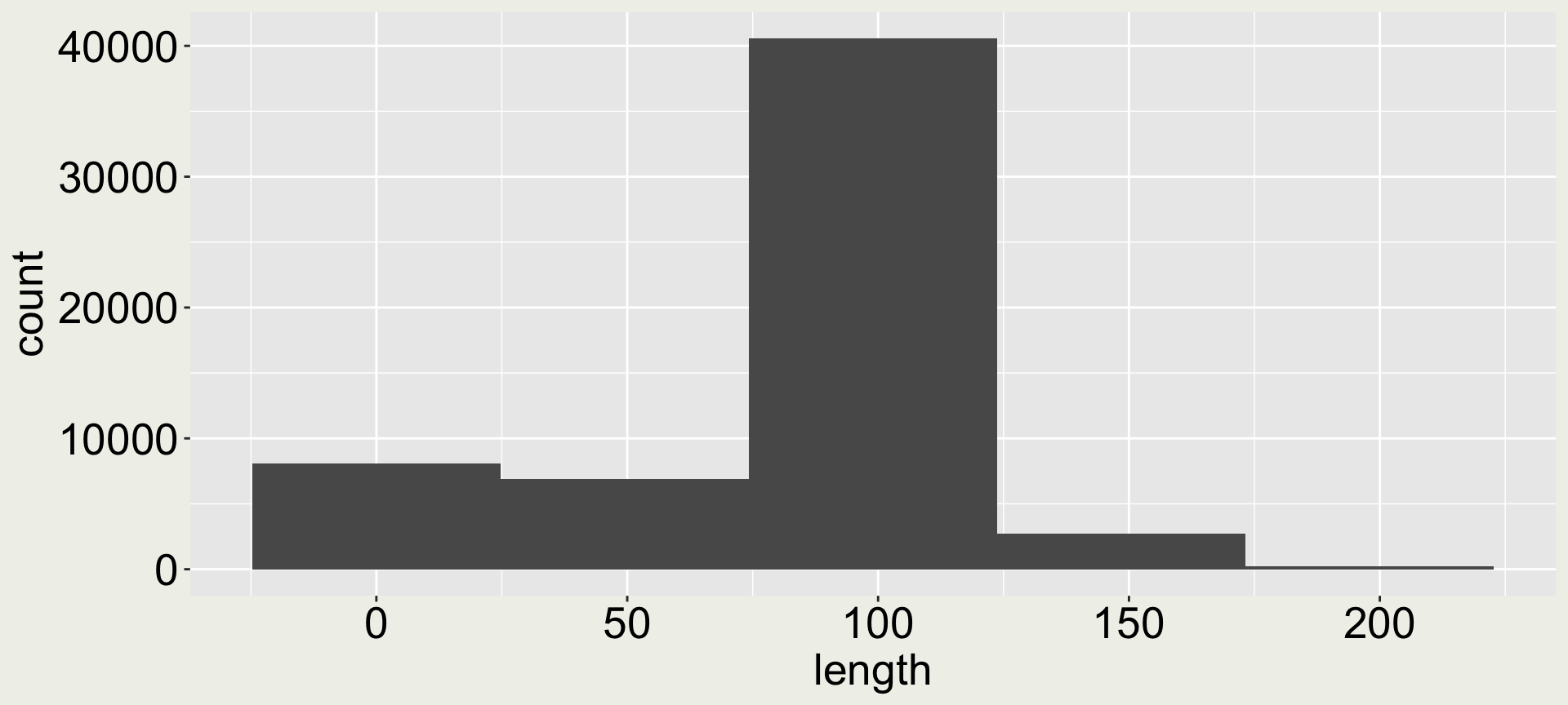
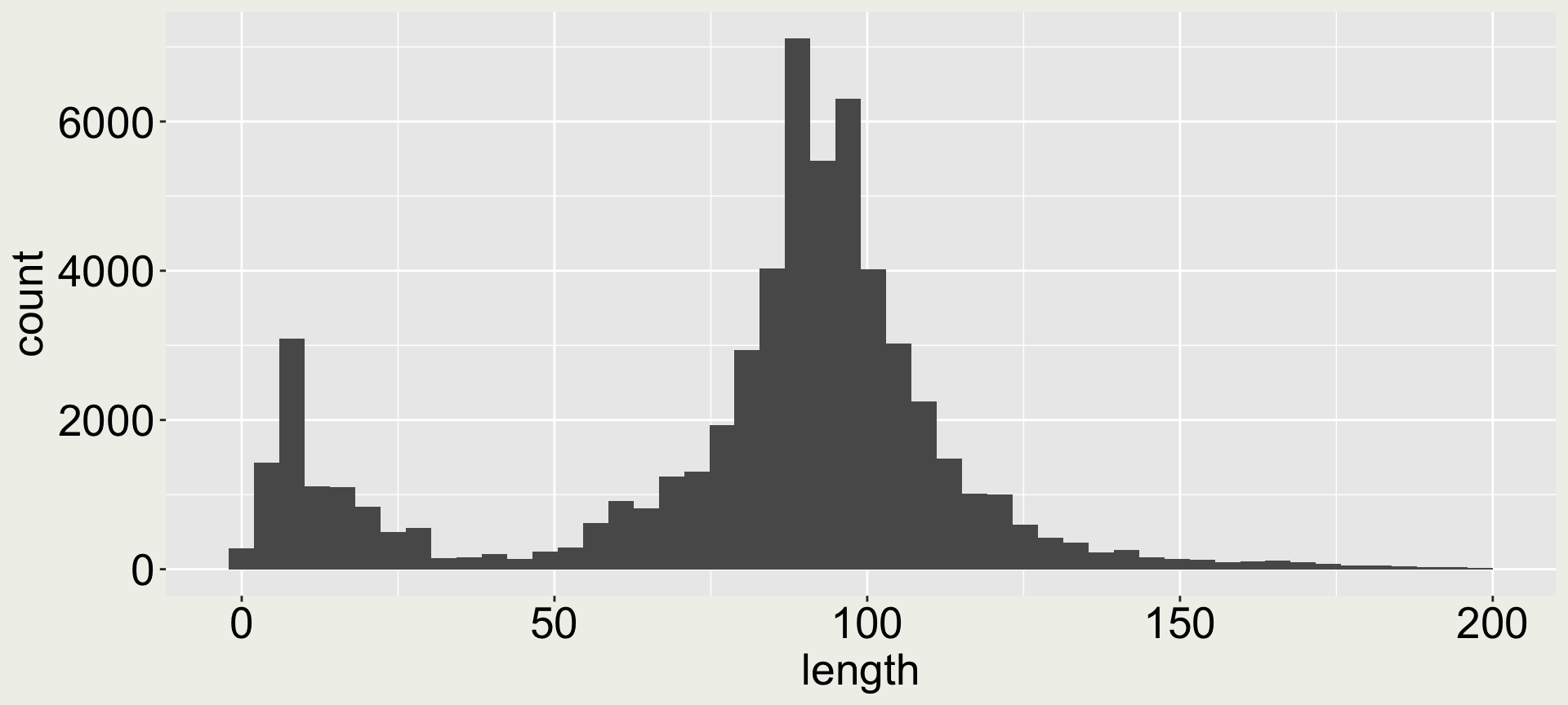
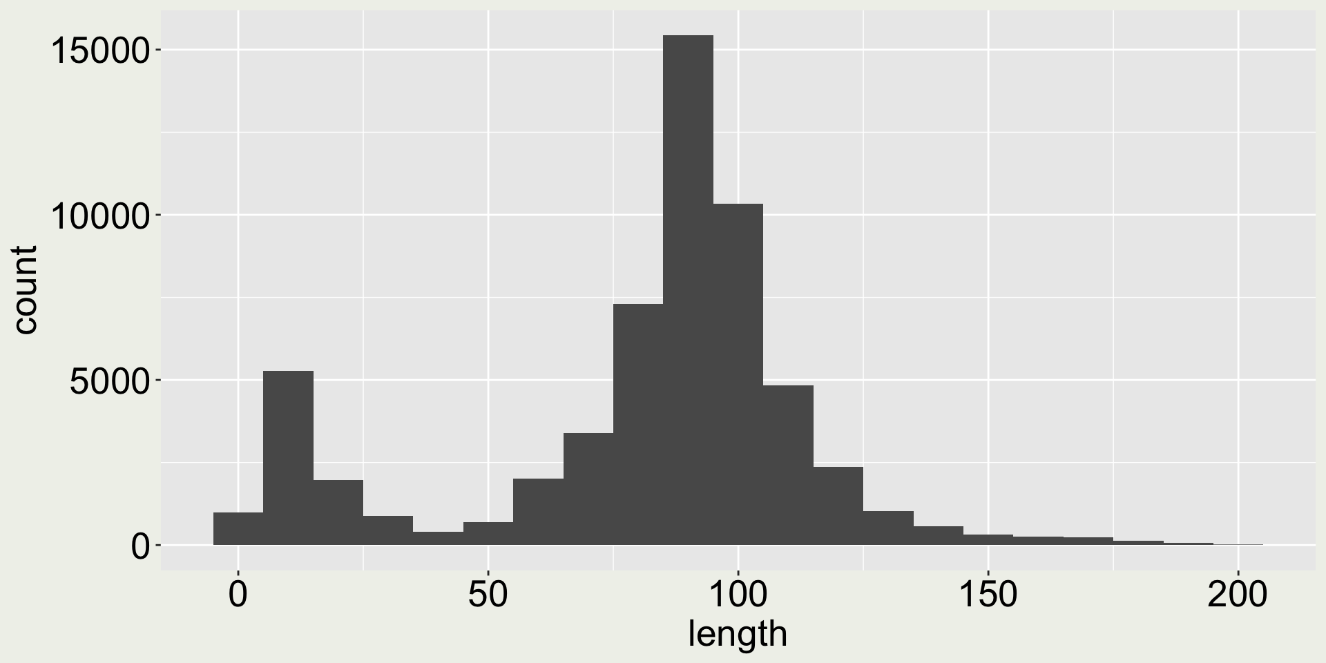
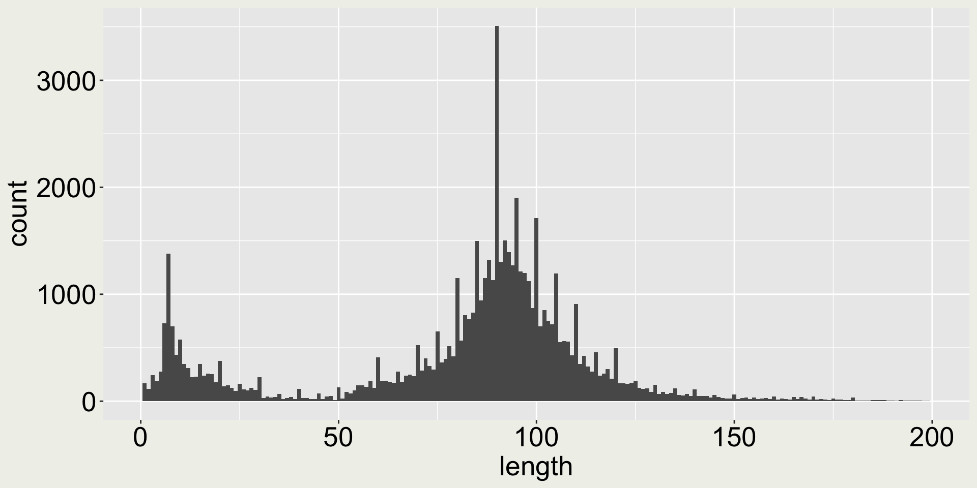
Arguments bins and binwidth in geom_histogram()
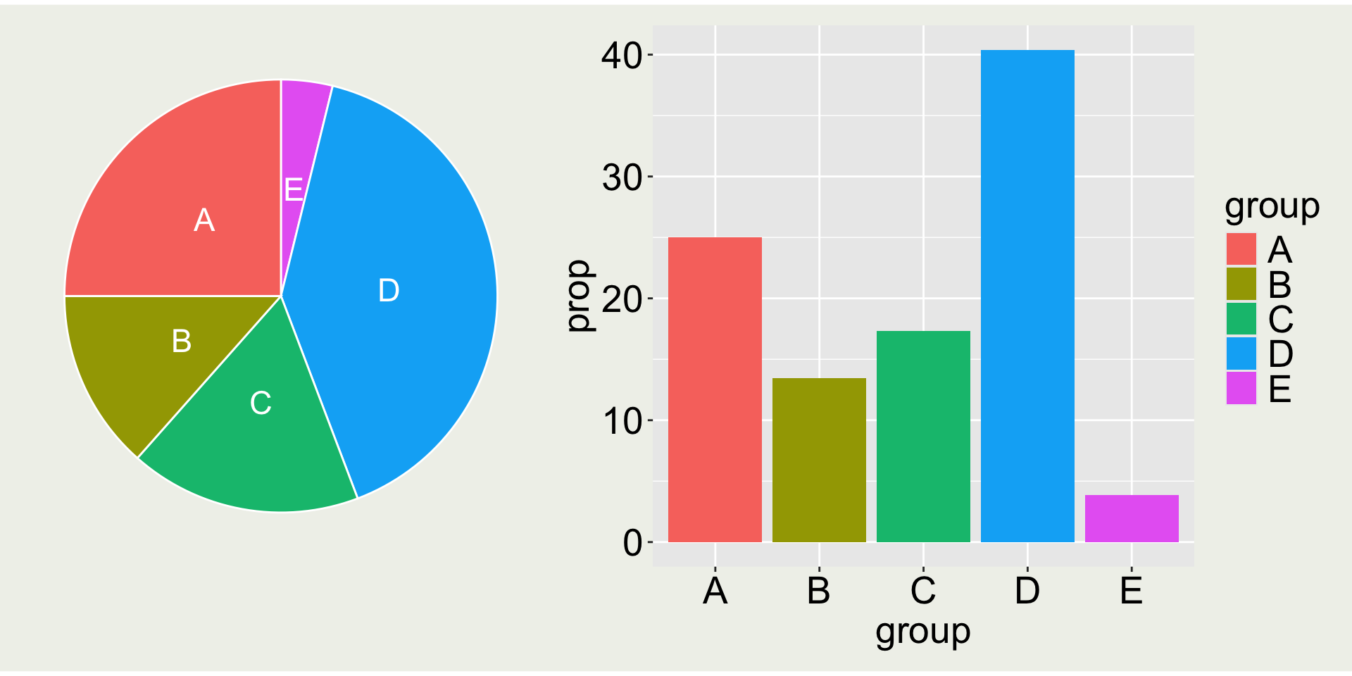
Which one is better: pie chart or bar chart?
Pie chart is almost never a good idea, because it is hard to compare the size of the slices e.g. A vs. C
General Social Survey data
It is a small subset of the questions from the 2016 General Social Survey, or GSS. The GSS is a long-running survey of American adults that asks about a range of topics of interest to social scientists.
# the package associated with the textbook # Data Visualization A practical introduction by Kieran Healylibrary(socviz) gss_sm
# A tibble: 2,867 × 32
   year    id ballot   age childs sibs  degree race  sex   region income16 relig
  <dbl> <dbl> <labe> <dbl>  <dbl> <lab> <fct>  <fct> <fct> <fct>  <fct>    <fct>
1  2016     1 1         47      3 2     Bache… White Male  New E… $170000… None
2  2016     2 2         61      0 3     High … White Male  New E… $50000 … None
3  2016     3 3         72      2 3     Bache… White Male  New E… $75000 … Cath…
4  2016     4 1         43      4 3     High … White Fema… New E… $170000… Cath…
# ℹ 2,863 more rows
# ℹ 20 more variables: marital <fct>, padeg <fct>, madeg <fct>, partyid <fct>,
#   polviews <fct>, happy <fct>, partners <fct>, grass <fct>, zodiac <fct>,
#   pres12 <labelled>, wtssall <dbl>, income_rc <fct>, agegrp <fct>,
#   ageq <fct>, siblings <fct>, kids <fct>, religion <fct>, bigregion <fct>,
#   partners_rc <fct>, obama <dbl>
The column count and prop are the statistics calculated from the data.
It will then plot x on the x-axis, the generated variable count on the y-axis, each bar is a group, there is only one panel (no facet), and bar is its own entity (group differs for each).
You can check the computed variables for each geom in the documentation
after_stat(count) - number of points in bin.
after_stat(prop) - groupwise proportion
What if we want to use a different variable calculated after stat?
You need to use after_stat() to tell ggplot2prop is not an original variable in the dataset, but something accessible only “after stat”.
There is also a geometry called geom_col() that does something similar. Read the example in the documentation with ?geom_col() and create the two plots above using geom_col().
Solution
geom_col() requires you to pre-compute the count or proportion:
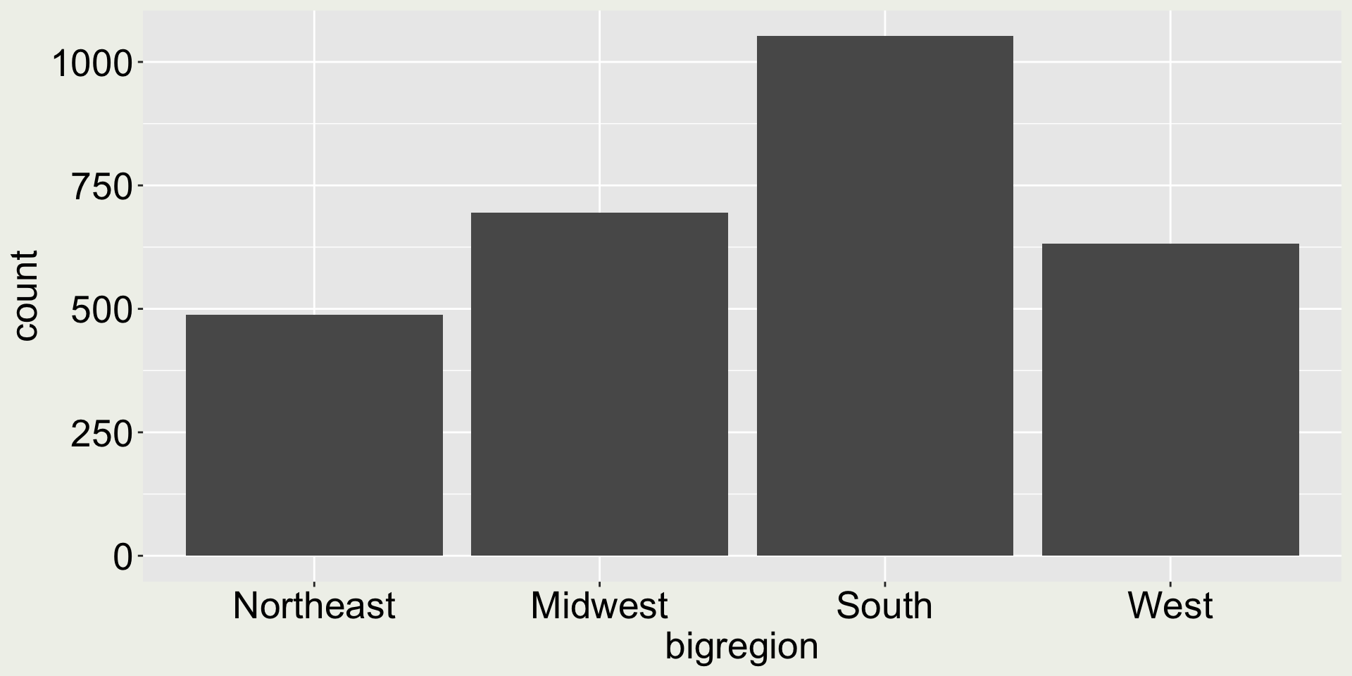
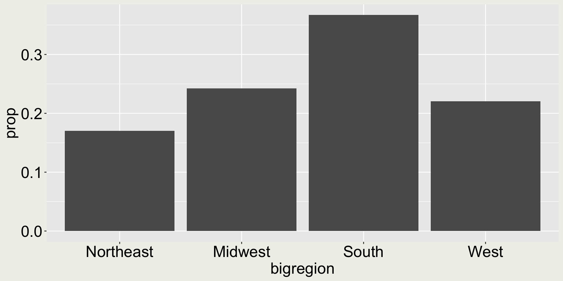
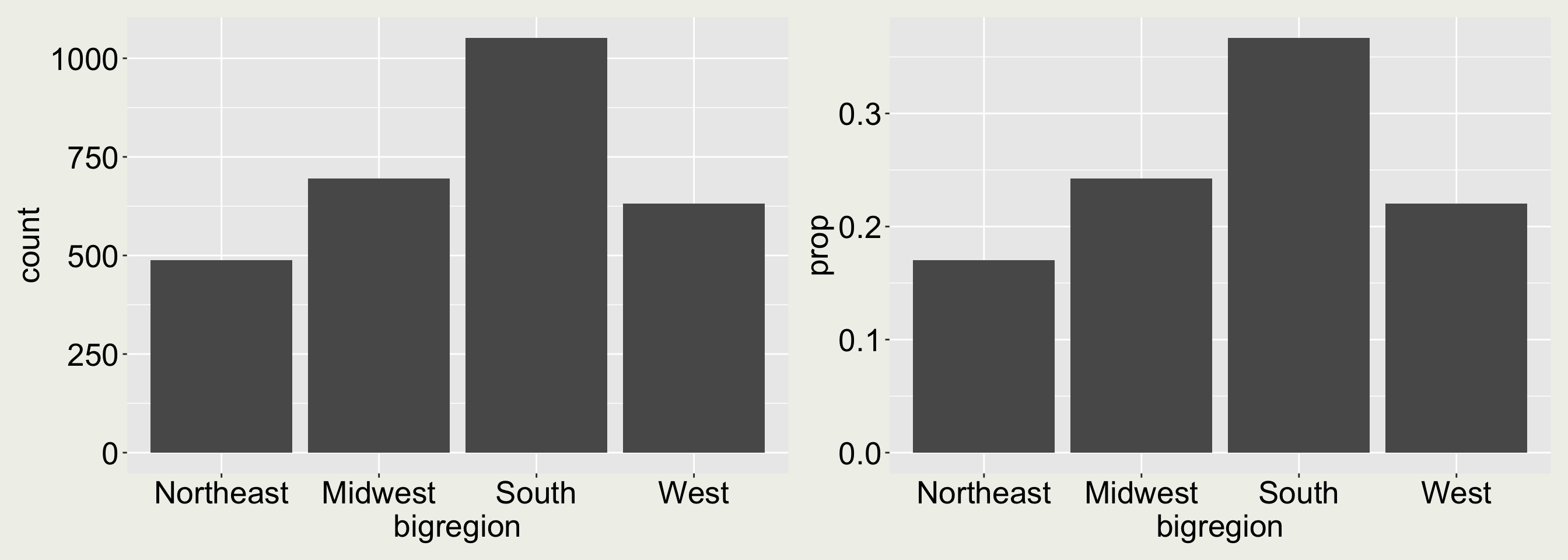
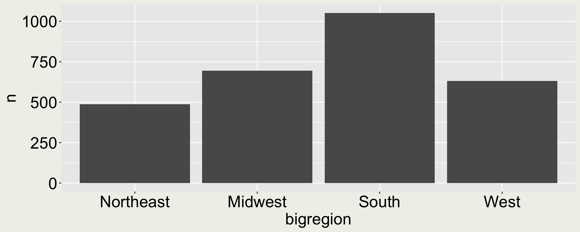
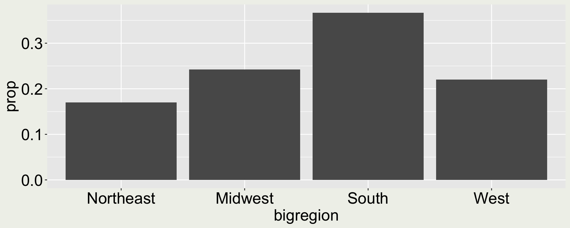
gss_cnt <- gss_sm |>count(bigregion) |>mutate(prop = n /sum(n))gss_cnt
# A tibble: 4 × 3
  bigregion     n  prop
  <fct>     <int> <dbl>
1 Northeast   488 0.170
2 Midwest     695 0.242
3 South      1052 0.367
4 West        632 0.220
ggplot(gss_cnt, aes(x = bigregion, y = n)) +geom_col()
ggplot(gss_cnt, aes(x = bigregion, y = prop)) +geom_col()
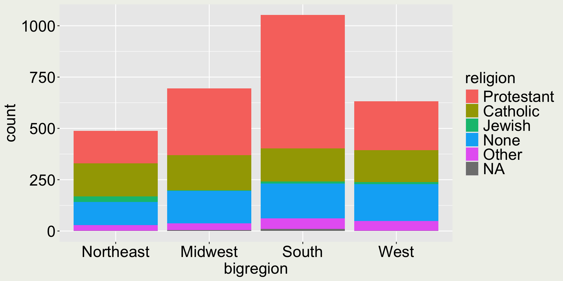
When there are two categorical variables
Show the count of (big)region and religion through the fill aesthetic
gss_sm |>ggplot(aes(x = bigregion, fill = religion)) +geom_bar()
Good or bad?
Again the “pie chart issue” - it is difficult to compare middle category, e.g. Catholic.
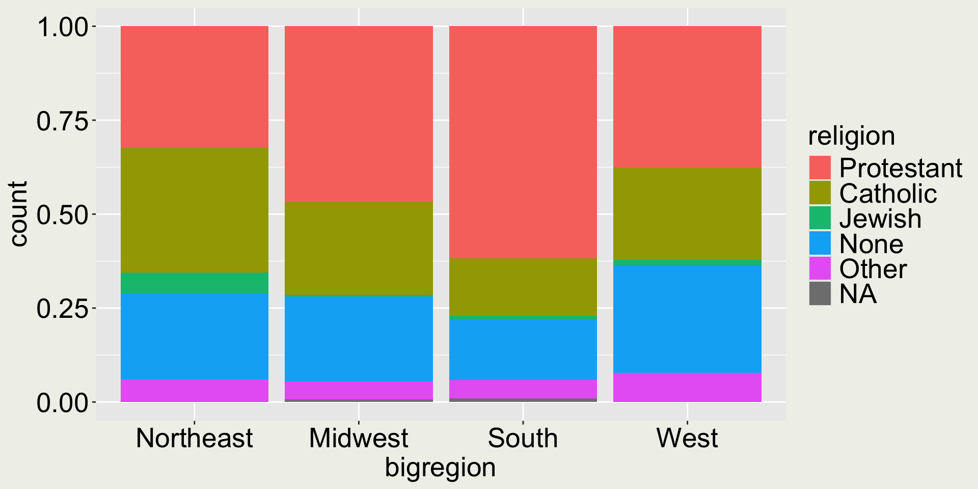
When there are two categorical variables
We can use position = "fill" to expand the bars to [0, 1]
gss_sm |>ggplot(aes(x = bigregion, fill = religion)) +geom_bar(position ="fill")
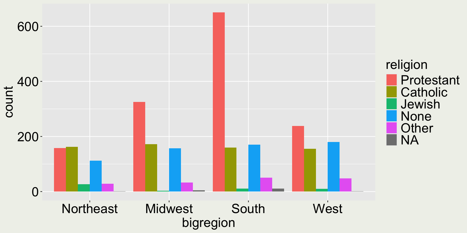
When there are two categorical variables
We can use position = "dodge" to make the bars within each group side-by-side:
gss_sm |>ggplot(aes(x = bigregion, fill = religion)) +geom_bar(position ="dodge")
In this plot, it is easy to compare for each (big)region, the count of each religion category.
Would you say it is easy to compare the same religion across different (big)regions?
When there are two categorical variables
To observe the change of count, our eyes need to trace the bars across regions.
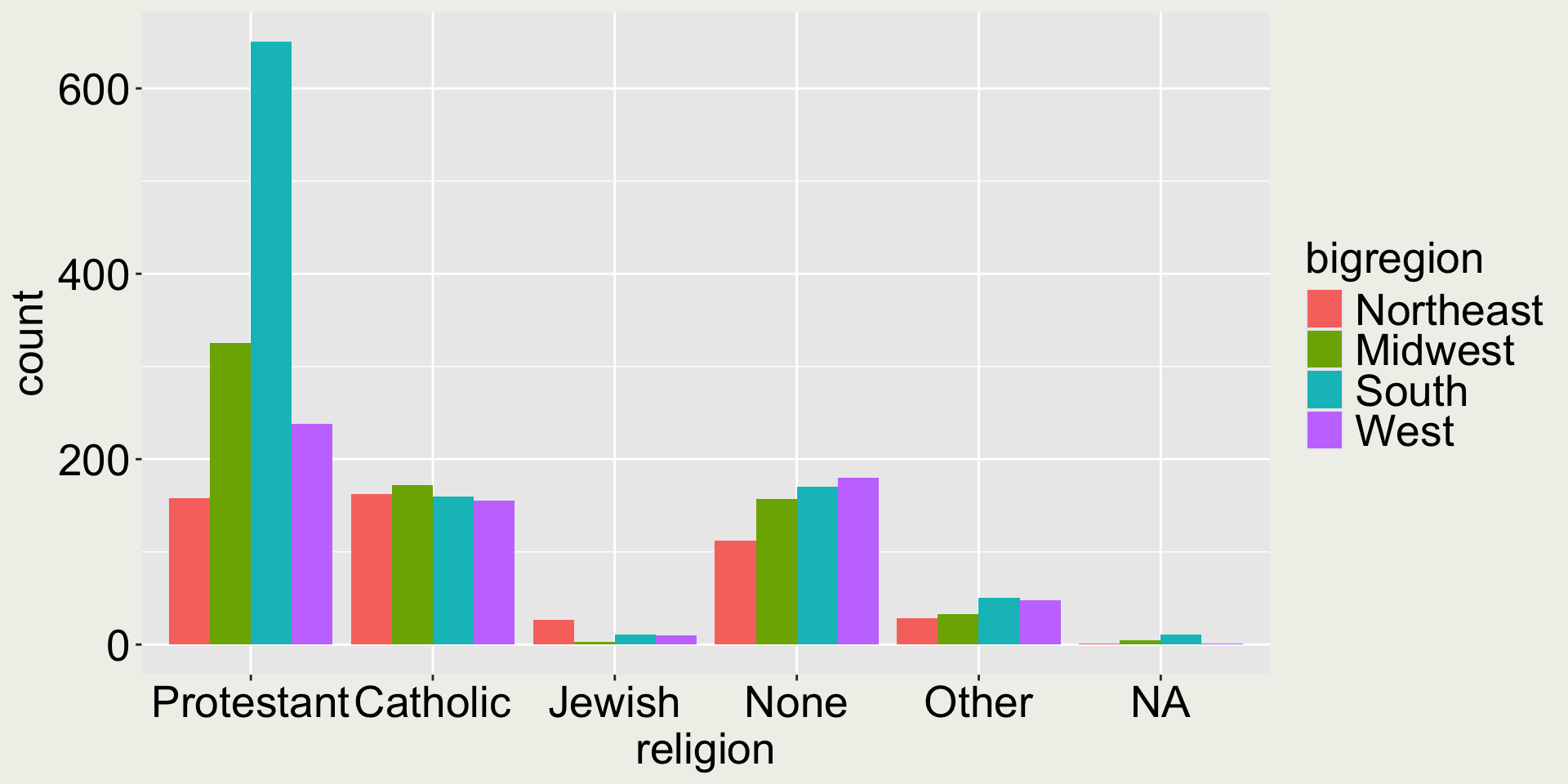
gss_sm |>ggplot(aes(x = bigregion, fill = religion)) +geom_bar(position ="dodge")
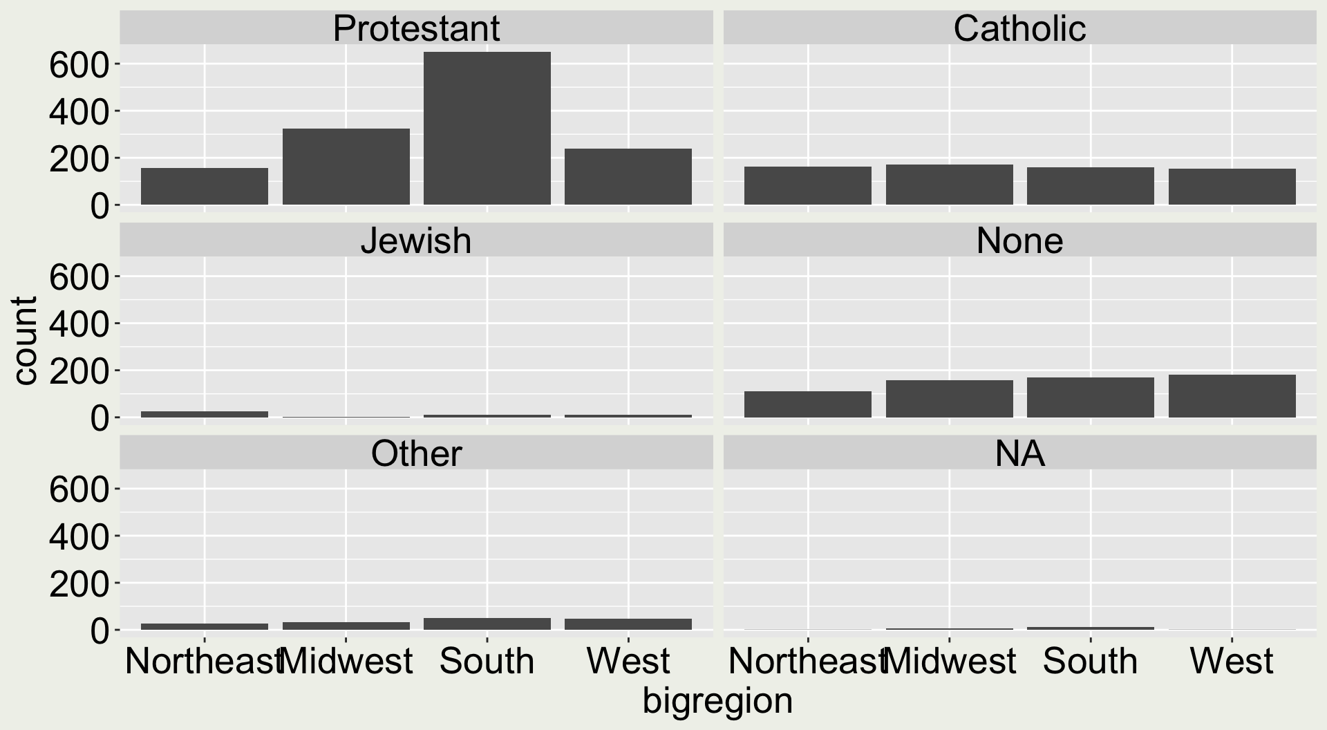
A better display would be to have each religion as a group and color by region
gss_sm |>ggplot(aes(x = religion, fill = bigregion)) +geom_bar(position ="dodge")
When you arrange the aesthetics differently, it tells different stories.
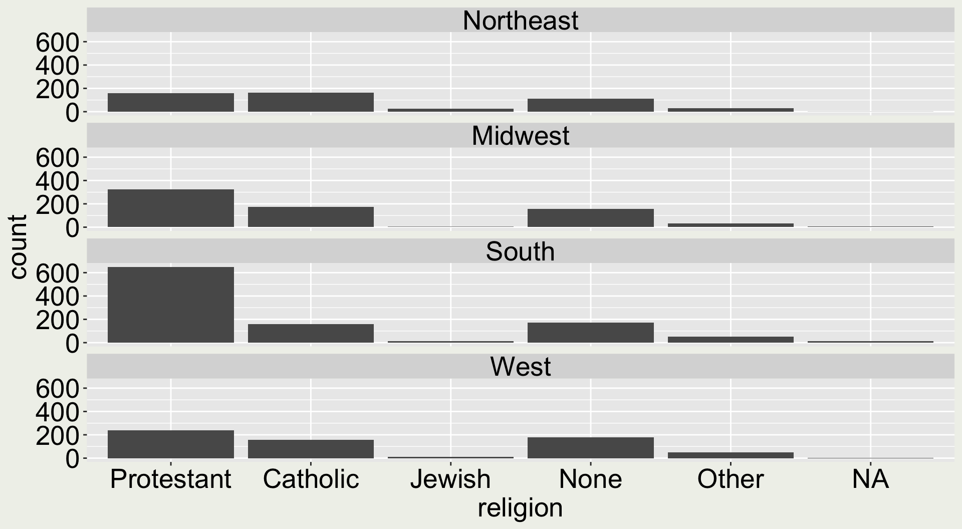
When there are two categorical variables
This point is probably easier to justify in facets
To observe differences of religion within each (big)region group
Your time - play around with arguments in facet_wrap
Let’s start from a base plot:
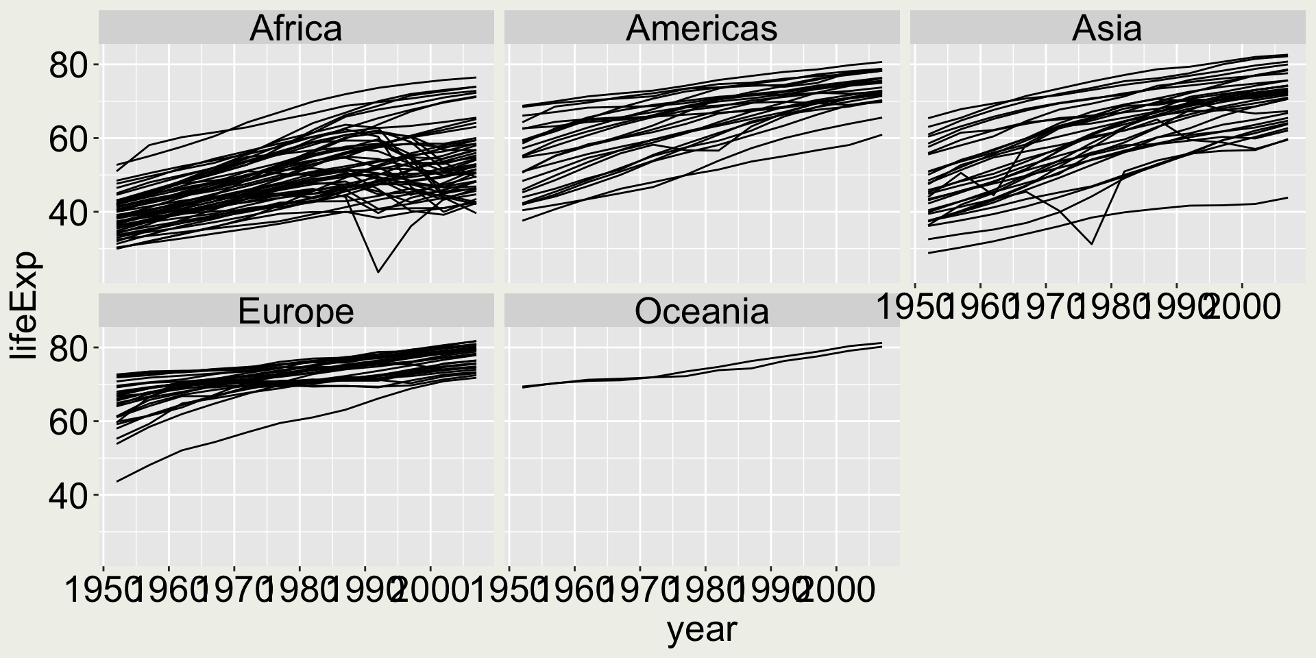
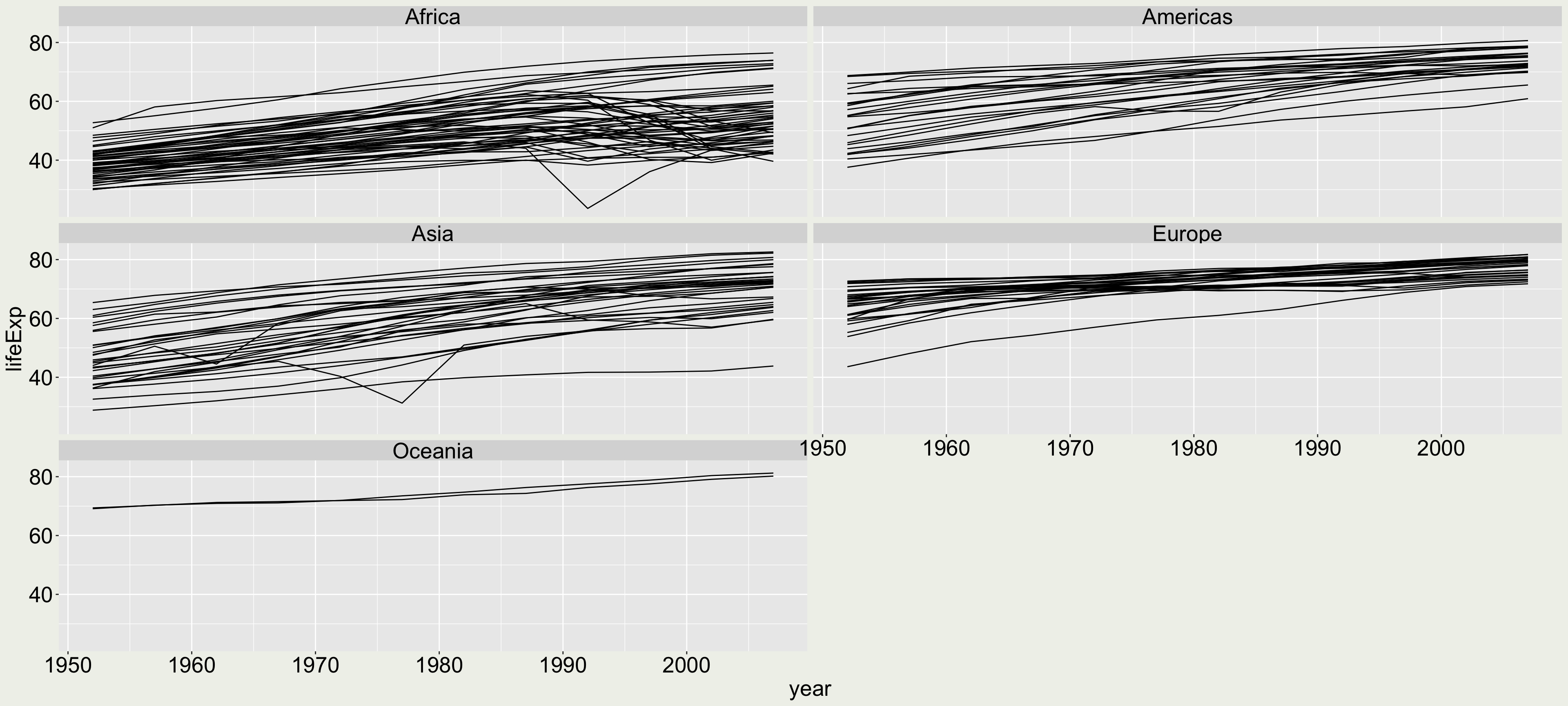
gapminder |>ggplot(aes(x = year, y = lifeExp, group = country)) +geom_line() +facet_wrap(vars(continent))
Make the following changes:
Arrange the panel to be 3 rows and 2 columns (I want to give each panel a wider horizontal space to display the time series)
Apply a local scale for the y-axis for each individual panel (as opposed to the global scale here) Would you say a global scale or a local scale is better in this plot?
Change the facet label header to “continent: Africa”, “continent: Americas”, … Would you say it is a god change to make in this plot?
Solution
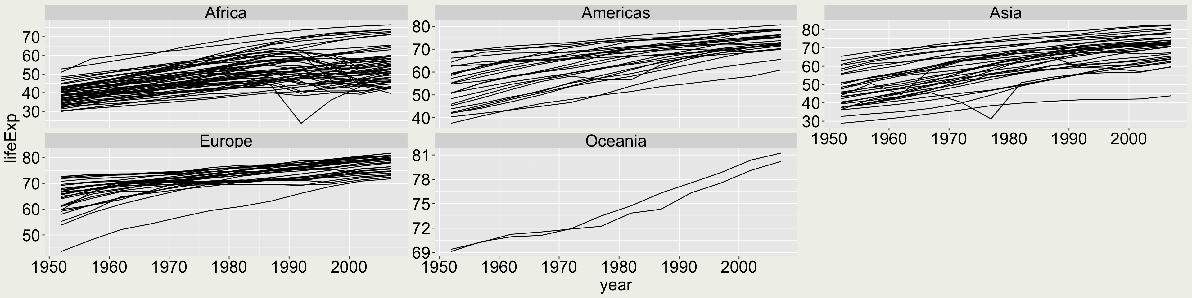
gapminder |>ggplot(aes(x = year, y = lifeExp, group = country)) +geom_line() +facet_wrap(vars(continent), ncol =2, nrow =3)
Solution
It is misleading here to apply the free scale because the two Oceania countries seem to have a much larger trend than others, but this is not true from the data.
gapminder |>ggplot(aes(x = year, y = lifeExp, group = country)) +geom_line() +facet_wrap(vars(continent), scales ="free_y")
When would this be useful: When one of the groups have small relative values than others, using a local scale can show within group data pattern.
Solution
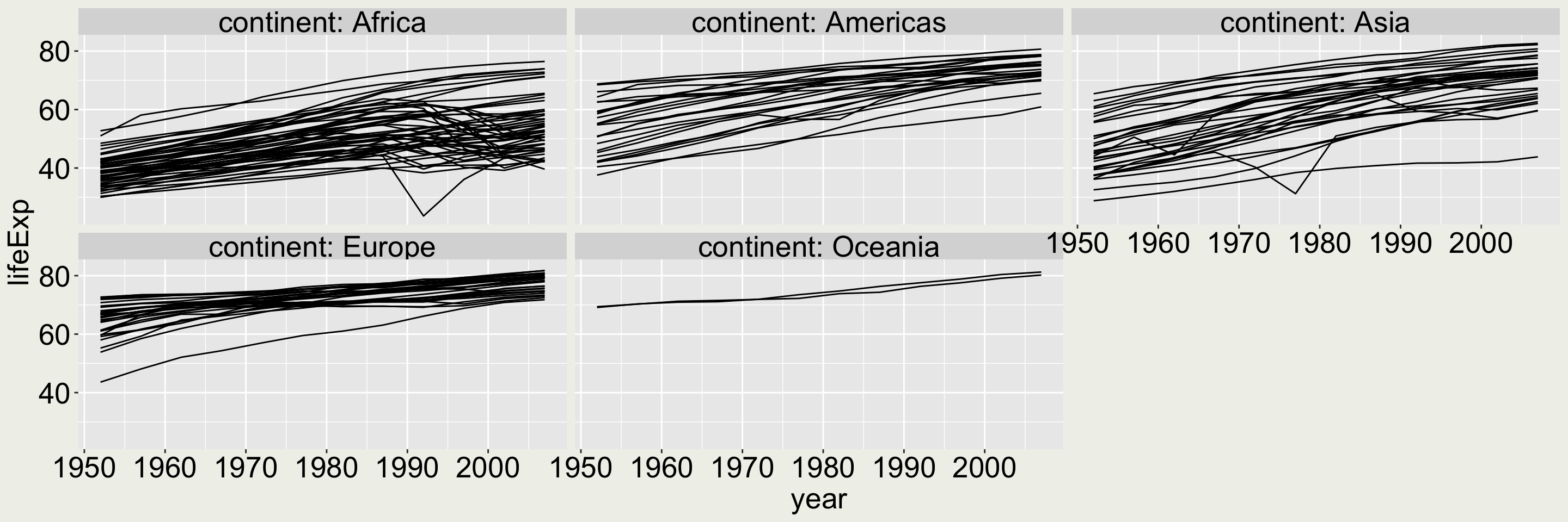
This is not very useful here because the same word “continent” appears in all the panels. Since it doesn’t provide more information, we would like to keep it to a minimal.
gapminder |>ggplot(aes(x = year, y = lifeExp, group = country)) +geom_line() +facet_wrap(vars(continent), labeller ="label_both")
Solution
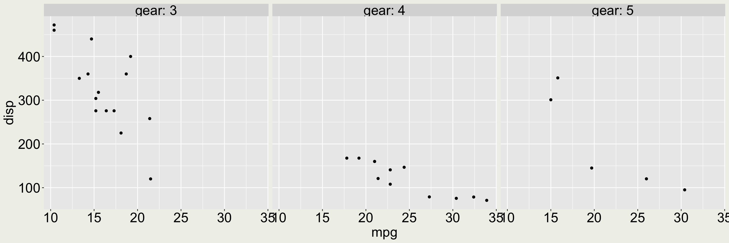
But in this example, labelling both the variable (gear) and the values (3, 4, 5) is useful because otherwise it is not clear what the values 3, 4, 5 refer to in the plot