Elements of Data Science
SDS 322E
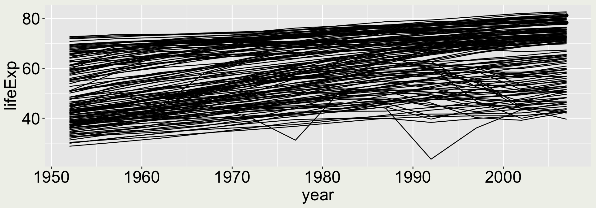
Combining multiple geometries

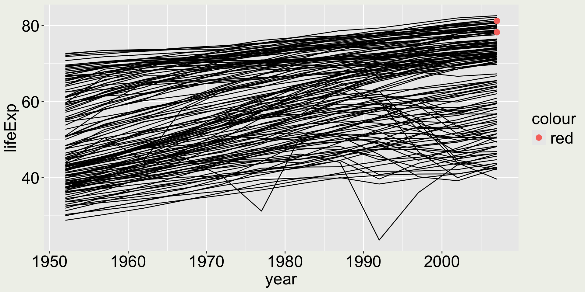
What if I want to highlight some points in the map? Say two points: 2007 for USA and Australia?
Combining multiple geometries - a naive try
What if we just add geom_point() to the above code?
We only want to highlight two points, not all the points
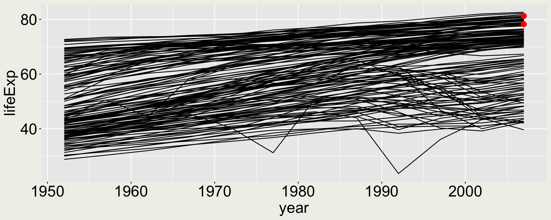
Combining multiple geometries - keep building
Separate dataset for each layer:
geom_line()- data:gapmindergeom_point()- data: only 2007 USA and Australia in thegapminderdata
We still can’t really see the two points ….
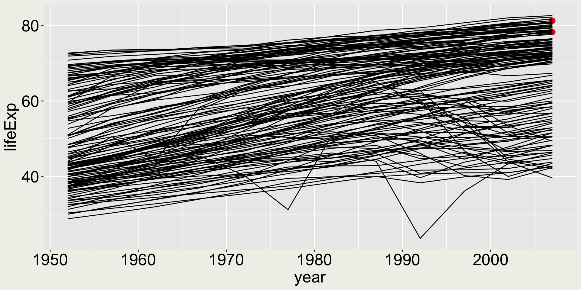
Combining multiple geometries - make it better
Make the two points bigger and a more distinguish color
These are NOT equivalent to the above
This gives an error:
Error in
fortify(): !datamust be a <data.frame>, or an object coercible byfortify(), or a valid <data.frame>-like object coercible byas.data.frame(), not aobject. ℹ Did you accidentally pass aes()to thedataargument?
Because at ggplot(aes(...)), the code doesn’t know what year and lifeExp it refers to - there is no data yet.
What would happen …
… if we do aes(color = "red")?
This looks okay, but….
What would happen …
… if we do aes(color = "blue")?

It colors the points in red but says “blue” in the legend - this is misleading!
It happens that the first color in the default color palette used by ggplot2 is red, so the previous example is misleading but looks okay.
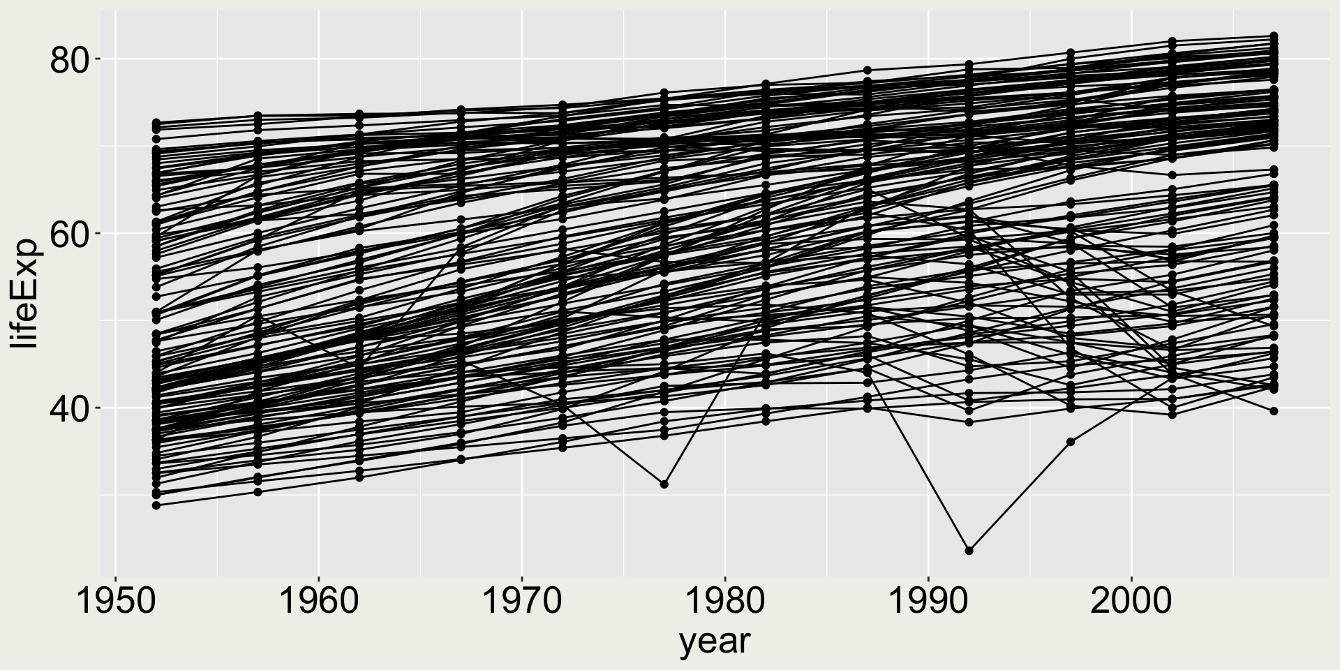
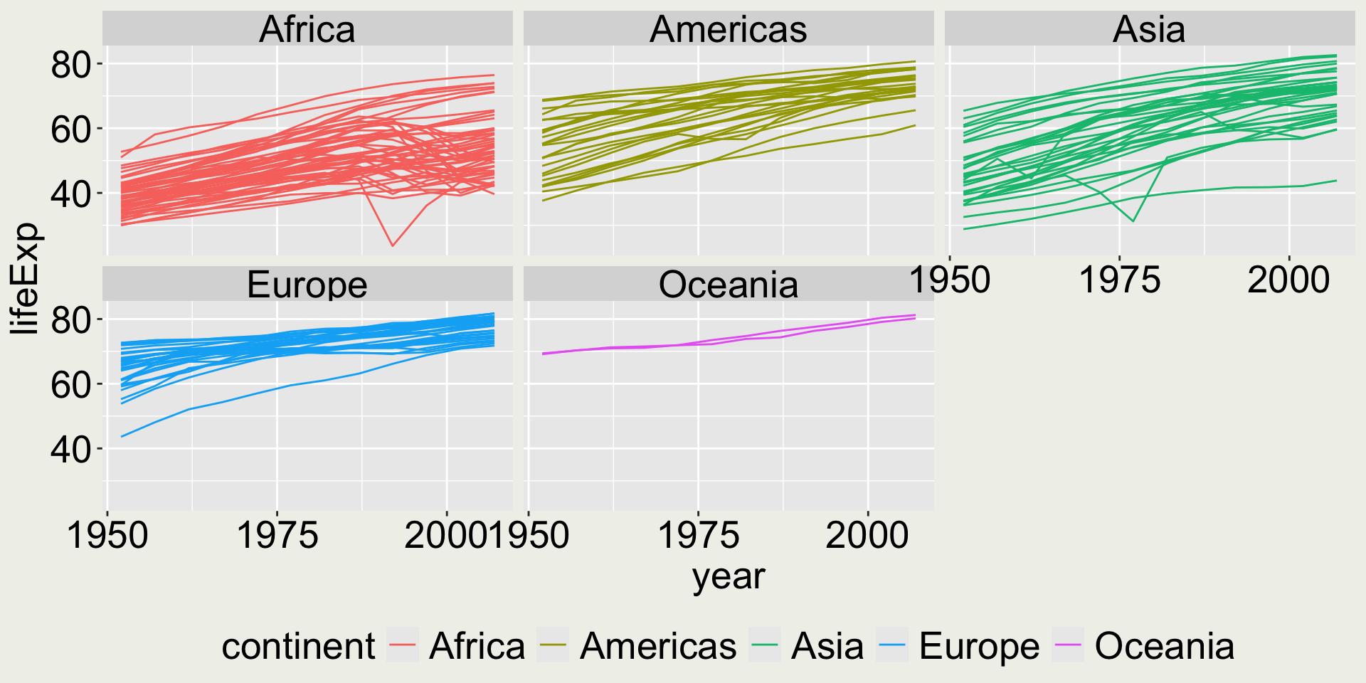
Is this a good plot?
aka what does it tell you?

I can see a general increasing trend for most countries, with two drops at around 1977 and 1992. Is it good enough?
Maybe adding some colors to reveal country/ continent information will help.
I want to add some colors to reveal country/ continent information
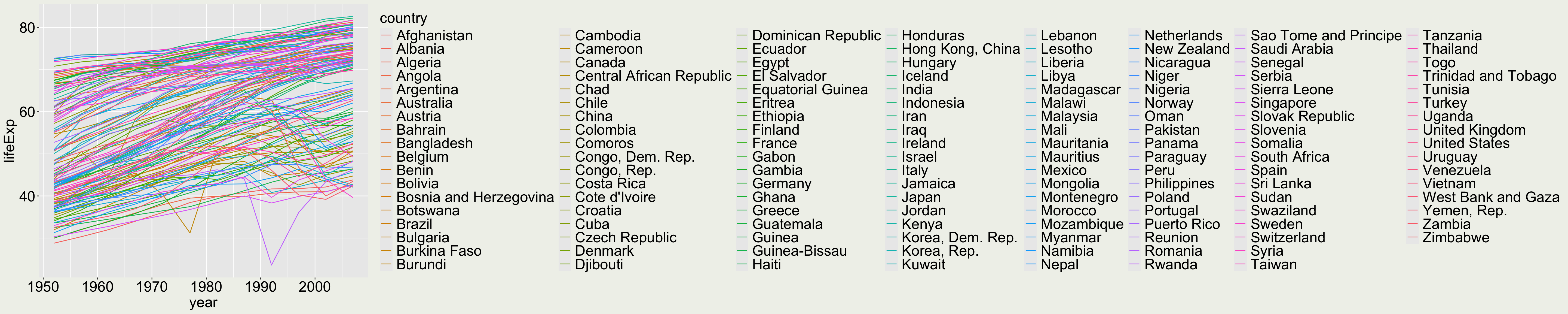
Ooops… this is bad (and should be avoided) because there are too many countries and the color mapping doesn’t allow you to read which color corresponds to which country.
Tip: When a categorical variable has too many levels, it is not a good idea to map it to color.
We need to think about how to reduce the number of levels and here we can use continent:
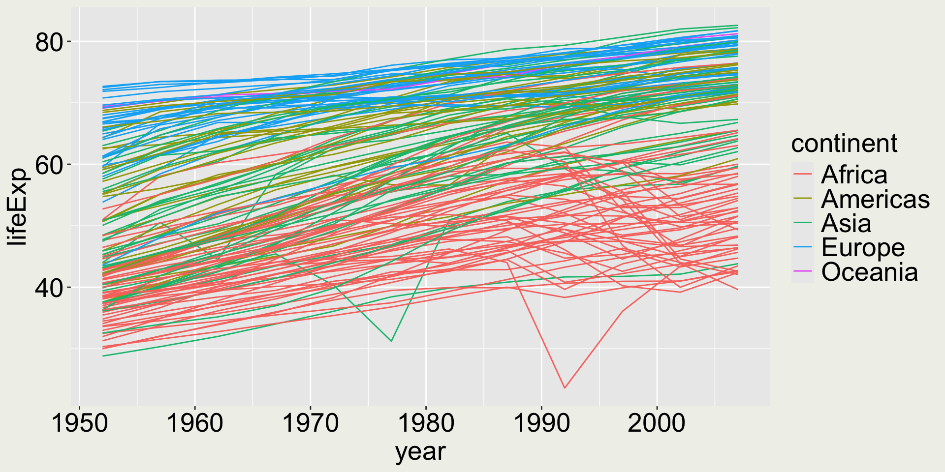
Now we can see Europe and Oceania have higher life expectancy among all countries, while Africa has the lowest, along with some Asian countries.
Maybe we want to add a label/ text to the countries with the lowest life expectancy:
ggplot(gapminder,
       aes(x = year, y = lifeExp, group = country)) +
geom_line(aes(color = continent)) +
# for Rwanda
geom_label(data = gapminder |> filter(lifeExp == min(lifeExp)),
aes(label = country)) +
# for Cambodia
geom_text(data = gapminder |> filter(year == 1977) |> filter(lifeExp == min(lifeExp)),
aes(label = country))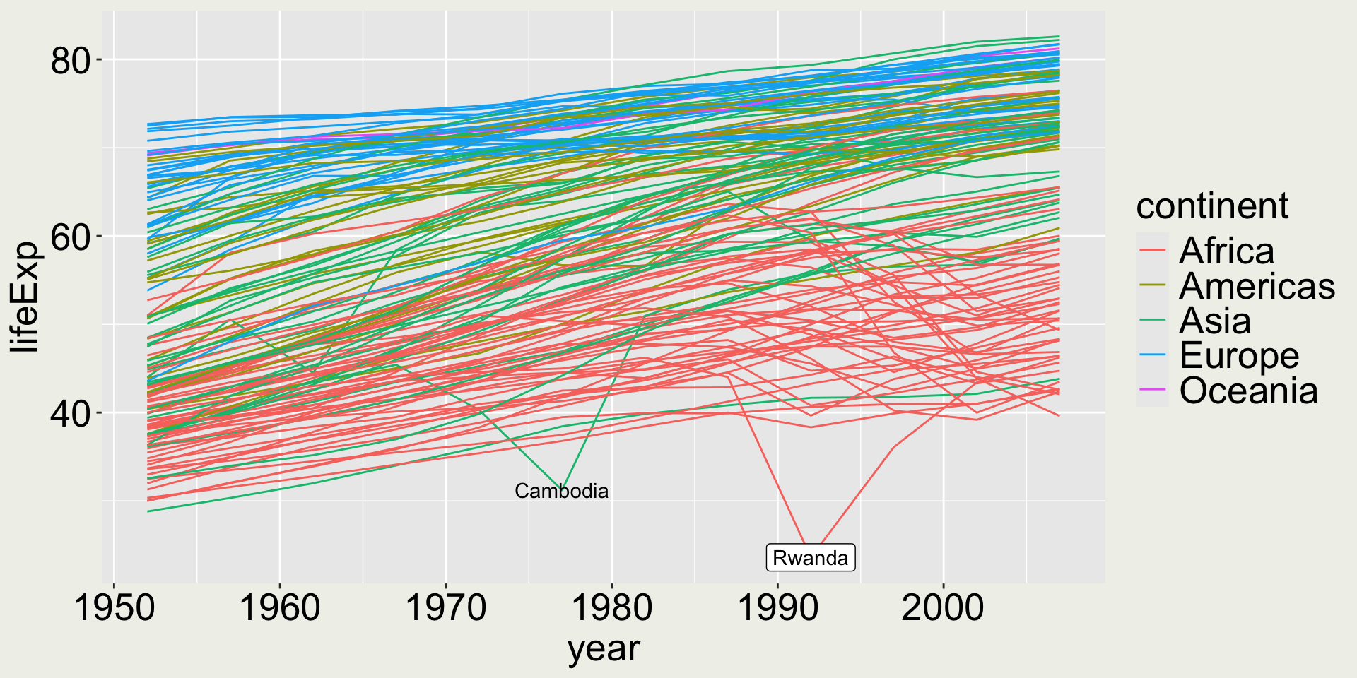
Check what ggrepel::geom_label_repel() and ggreple::geom_text_repel() do!
Is it a good idea to facet the plot by country?
How about geom_point()?
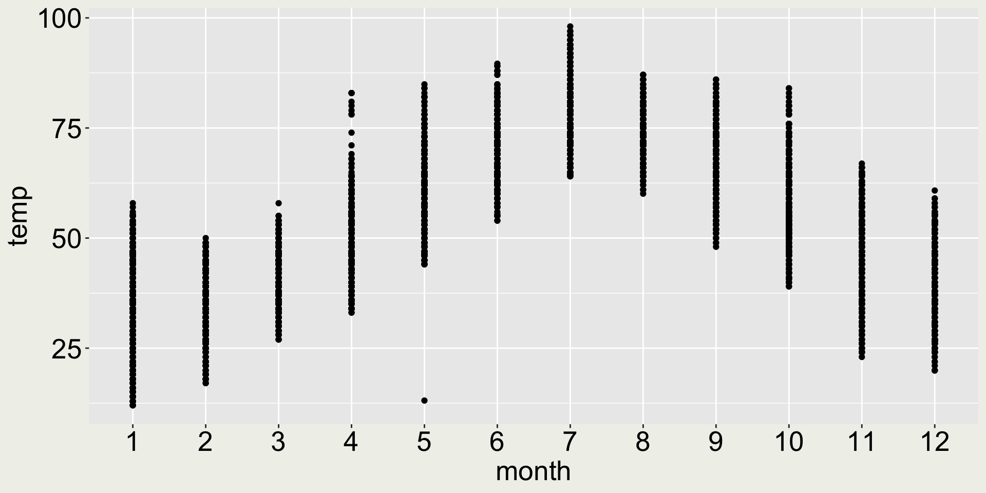
- 😿 the points are squashed together, we can’t see the distribution
- 😄 but it does allow us to see there is one particular point with the lowest temperature in May
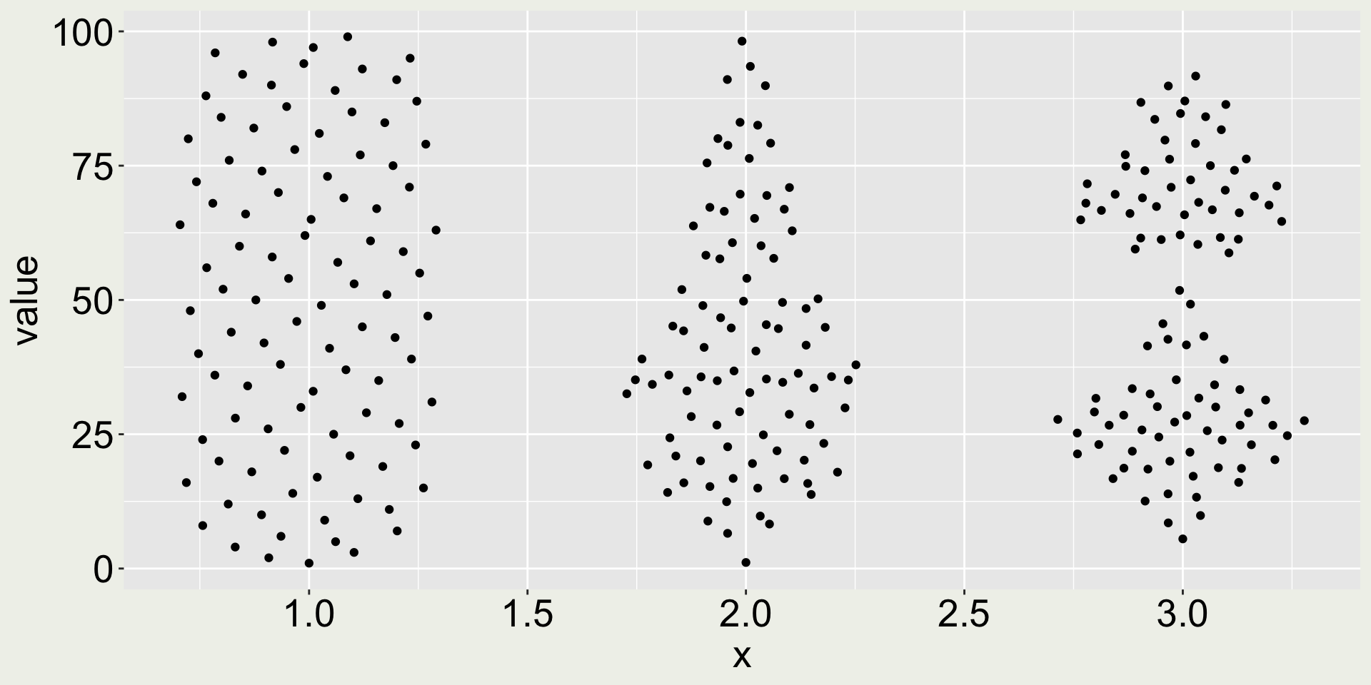
How about geom_jitter()?
As an alternative to geom_point(), geom_jitter() adds a small amount of random noise to the position of each point, which helps to spread out the points and make them more visible.
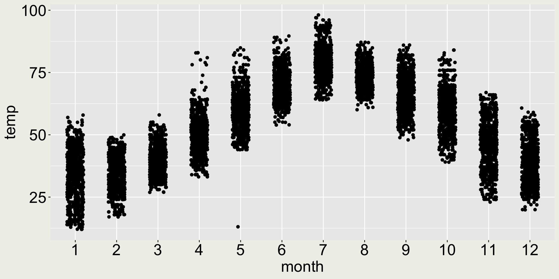
- 😿 the points are loosen up, but we can’t see the distribution
How about geom_boxplot()?
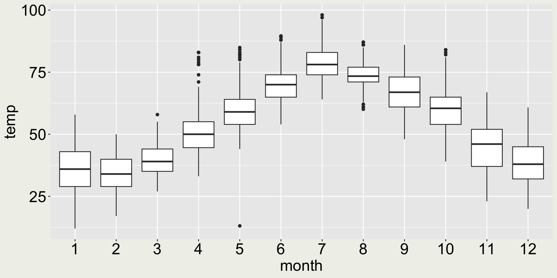
- 😿 now we can see the five number summary - better than all the points lining up in one line
How about geom_violin()?
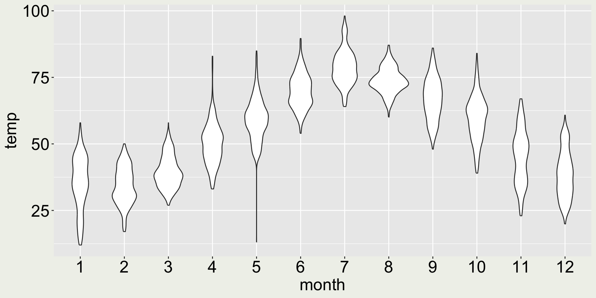
- 😀 now we can see the distribution and the long whisker in May signals the interesting low temperature in May. Sure…
How about geom_quasirandom()?
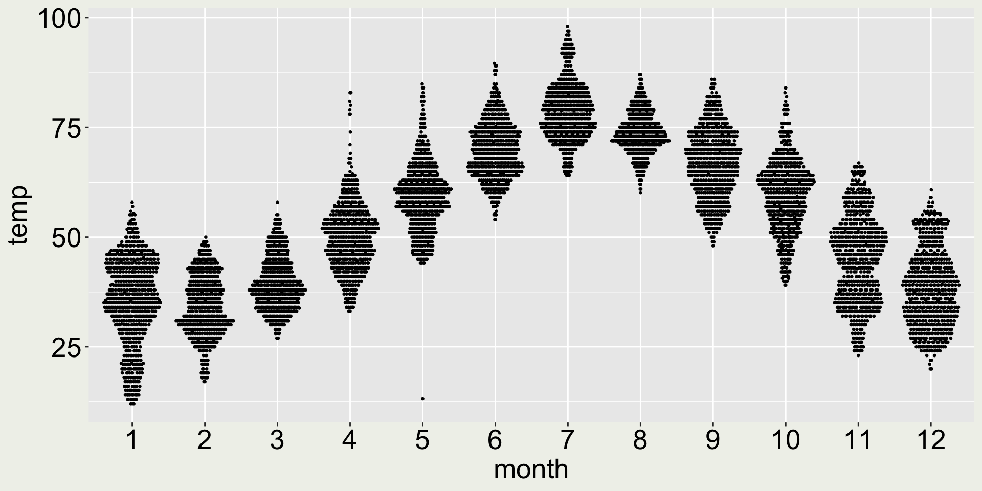
- 😆 the long whisker in May signals the interesting low temperature in May
- 😄 Now we can see the distribution: most of the days in March is around 40F, but In November, the temperature is bi-modal: part of it clusters are around 40F and another around 50F.
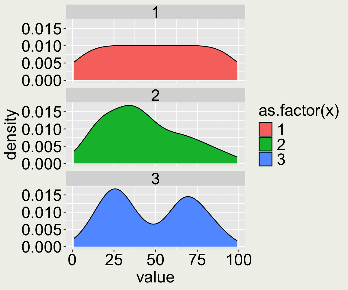
Why are distributions important? (1/4)
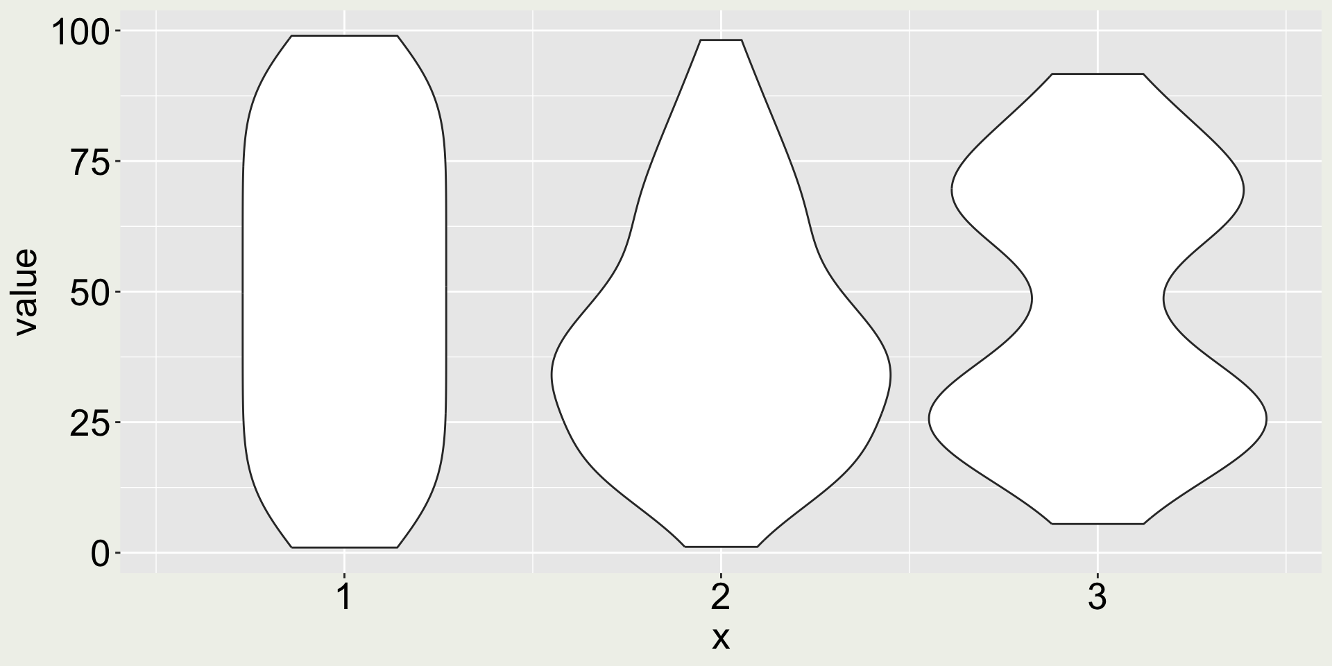
I have simulated three sets of observations (100 observations each), dt, and plot them using geom_boxplot().
Does the boxplot tell you anything about the distribution of the data?
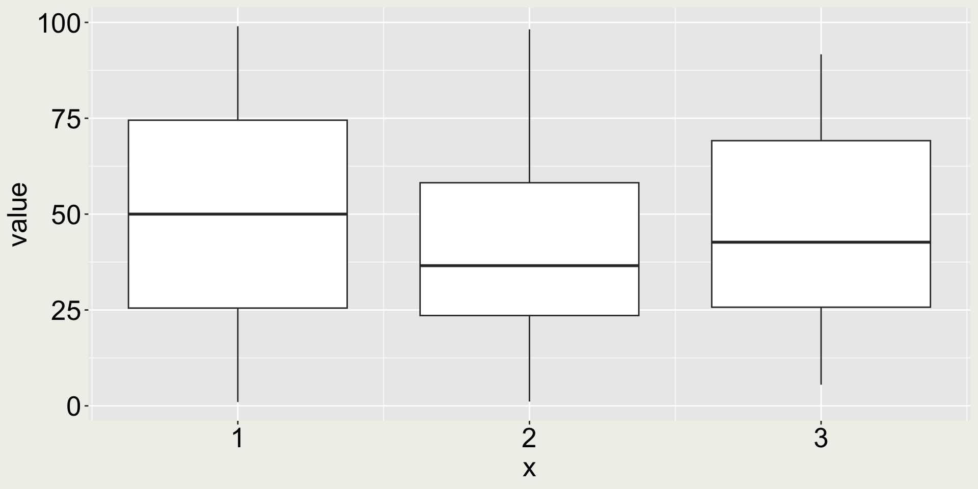
Is it so?
Why are distributions important? (2/4)
Why are distributions important? (3/4)
Why are distributions important? (4/4)
You don’t need to know the following for this class but in case you’re interested in how the data is generated.
Remark 1: What happen if I don’t have facets?
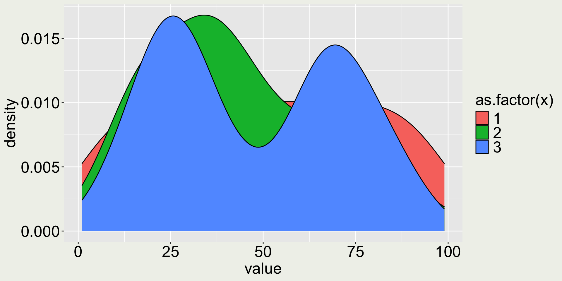
This doesn’t look very nice - we can’t see the distributions at the back.
What should we do?
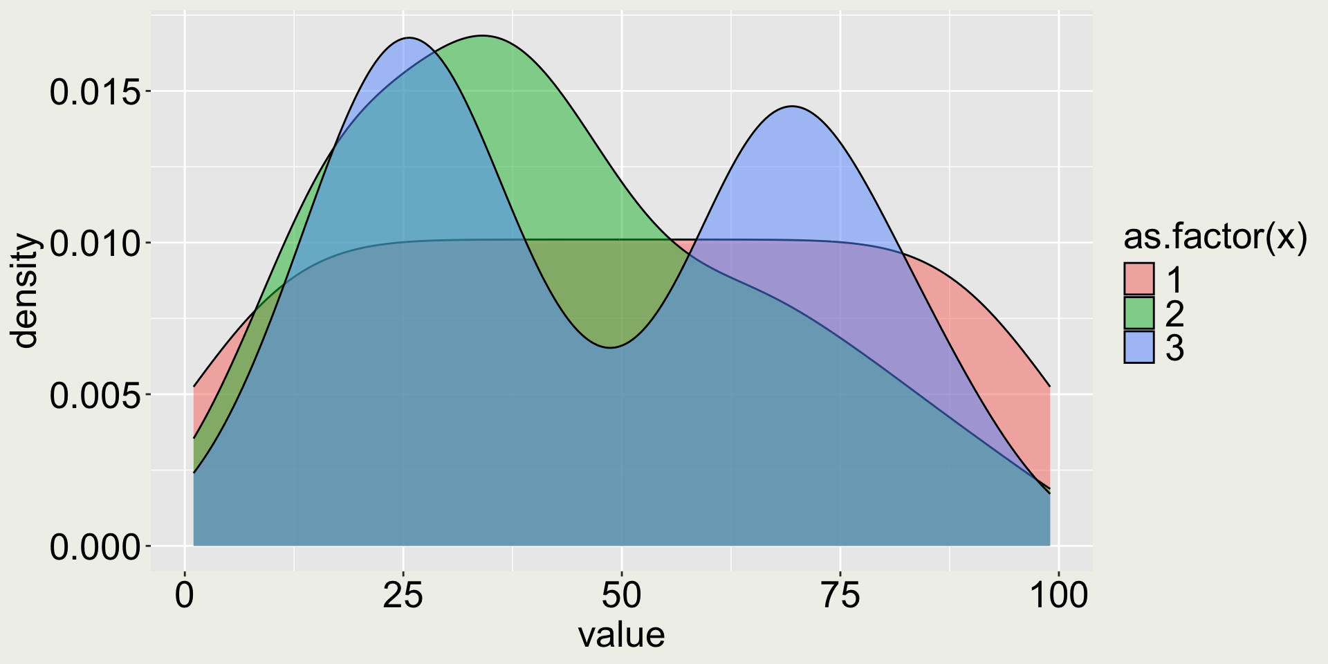
Remark 2: does adding color make it better?
- 😿 the color doesn’t add any more information because month is already on the x-axis
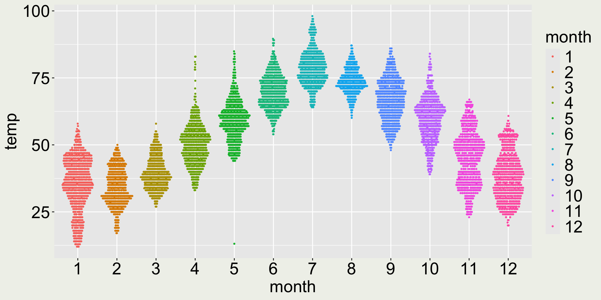
What’s the issue with the plot on the left?
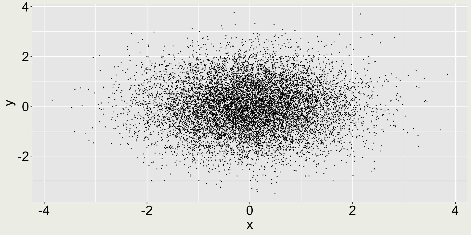
When plotting too many points, we may consider reduce the point size to avoid overplotting.