   x1 x2 x3 x4    y1   y2    y3    y4
1  10 10 10  8  8.04 9.14  7.46  6.58
2   8  8  8  8  6.95 8.14  6.77  5.76
3  13 13 13  8  7.58 8.74 12.74  7.71
4   9  9  9  8  8.81 8.77  7.11  8.84
5  11 11 11  8  8.33 9.26  7.81  8.47
6  14 14 14  8  9.96 8.10  8.84  7.04
7   6  6  6  8  7.24 6.13  6.08  5.25
8   4  4  4 19  4.26 3.10  5.39 12.50
9  12 12 12  8 10.84 9.13  8.15  5.56
10  7  7  7  8  4.82 7.26  6.42  7.91
11 5 5 5 8 5.68 4.74 5.73 6.89Elements of Data Science
SDS 322E
Why data visualization?
Aren’t data summary enough? Apparently not!
Anscombe’s quartet
Summary of average for x and y:
# A tibble: 4 × 3
  set   mean_y mean_x
  <chr>  <dbl>  <dbl>
1 1       7.50      9
2 2       7.50      9
3 3       7.5       9
4 4       7.50      9
The four sets of data are very different, even with the same average of x and y!

Why data visualization?
It helps with exploratory data analysis (EDA)
I may expect longer distance flights take longer time in the flight data - does the data support this?
Plot air line against distance to check
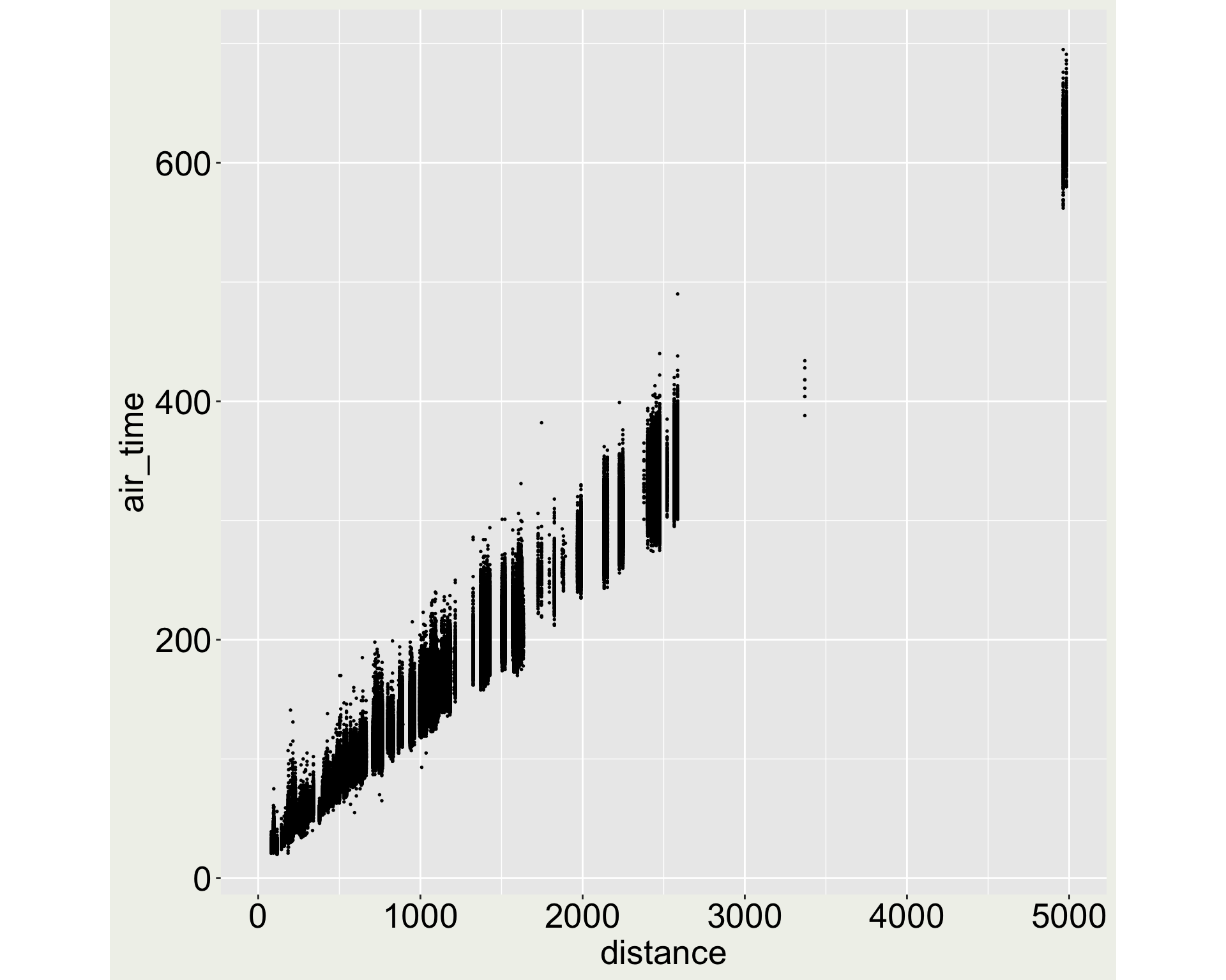
What are those points close to 5000 miles (and those between 3000 and 4000 miles)?
Let’s filter the data to see what they are
Why data visualization?
For communicating information
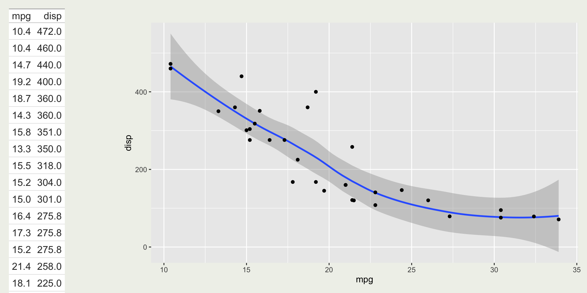
mtcars: relationship between miles per gallon (mpg) and displacement (disp)
Data visualization for communicating information
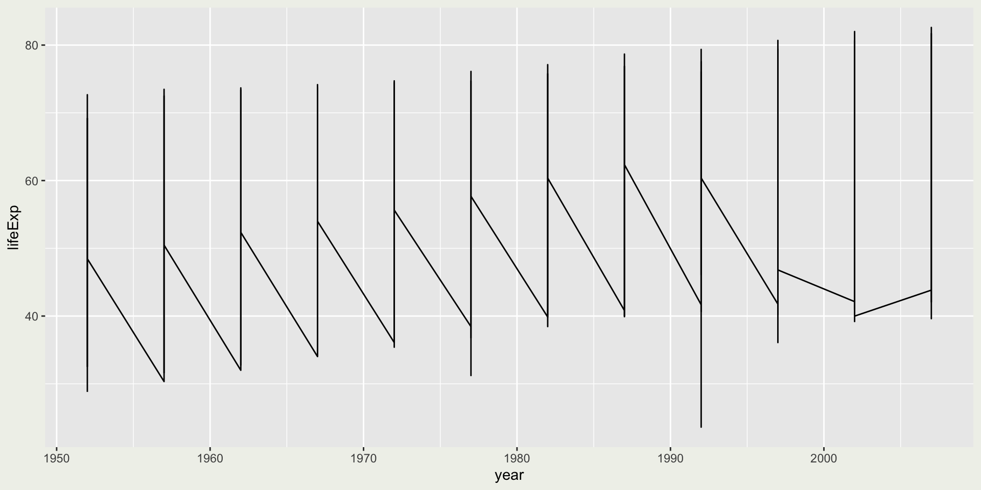
Plot the life expectancy (lifeExp) over the years (year) for all countries in the gapminder dataset
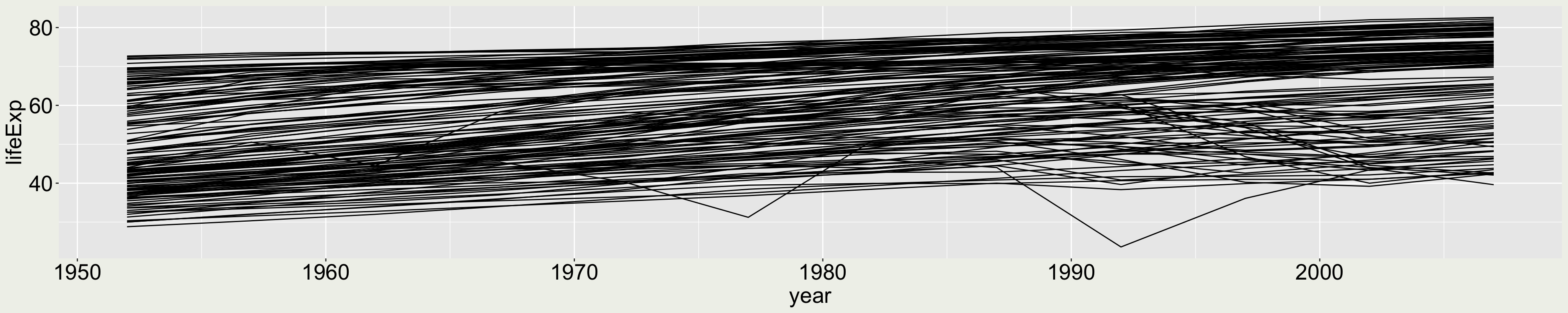
😞 This is misleading because the lines almost look like flat.
Data visualization for communicating information
Plot the displacement (disp) for different car models in the mtcars dataset.
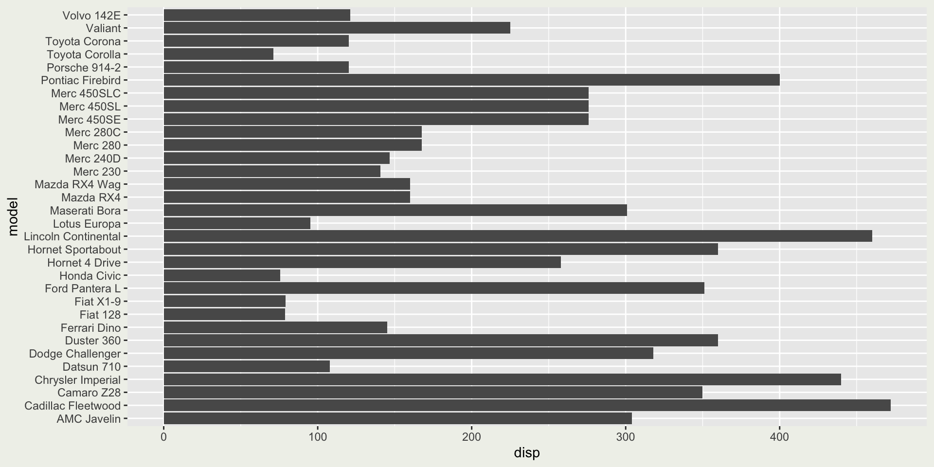
😭 This is not informative since it is difficult to tell how displacement relates to car models.
Data visualization for communicating information
Plot the same bar chart but with colors.
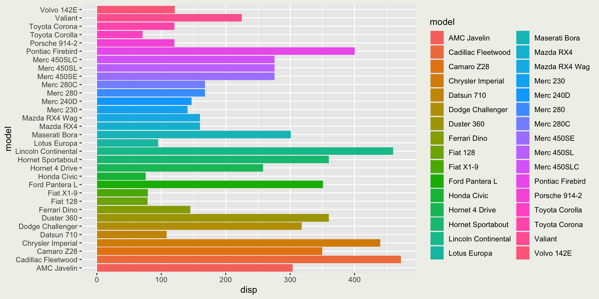
😢 This is also not informative because the colors don’t add more information to the plot and it is arguably aesthetically pleasing (or we may say it is dazzling).
Data visualization for communicating information
Plot the same bar chart but with colors representing the number of cylinders (cyl).
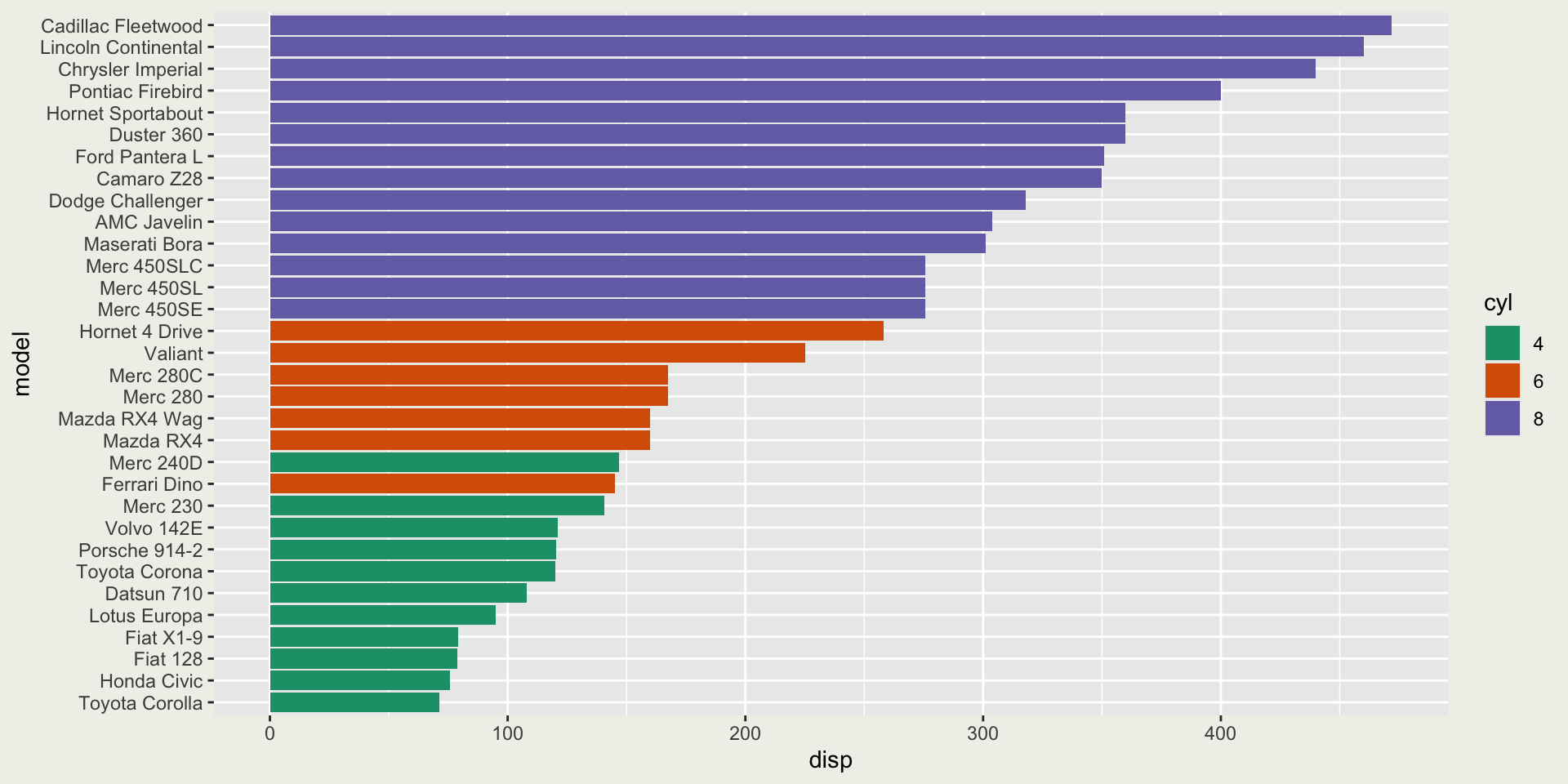
😄 This is informative because we can learn from the plot that larger cylinders tend to have larger displacements.
Base R plots
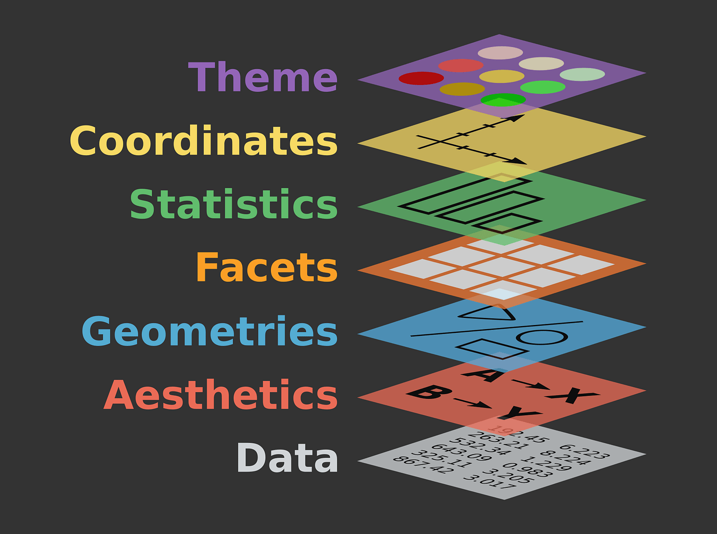
Grammar of Graphics
Essential elements:
- Data
- Aesthetics: how variables in the data are mapped to visual properties (x-axis, y-axis, color, fill, etc)
- Geometries: the type of plot (scatter plot, line plot, etc)
Additional elements:
- Facets: create panels (small multiples)
- Statistics: how data are summarized
- Coordinates: modify the coordinate system (cartesian, polar, etc)
- Themes: modify the overall appearance (background color, grid lines, text size, etc)
Let’s build!
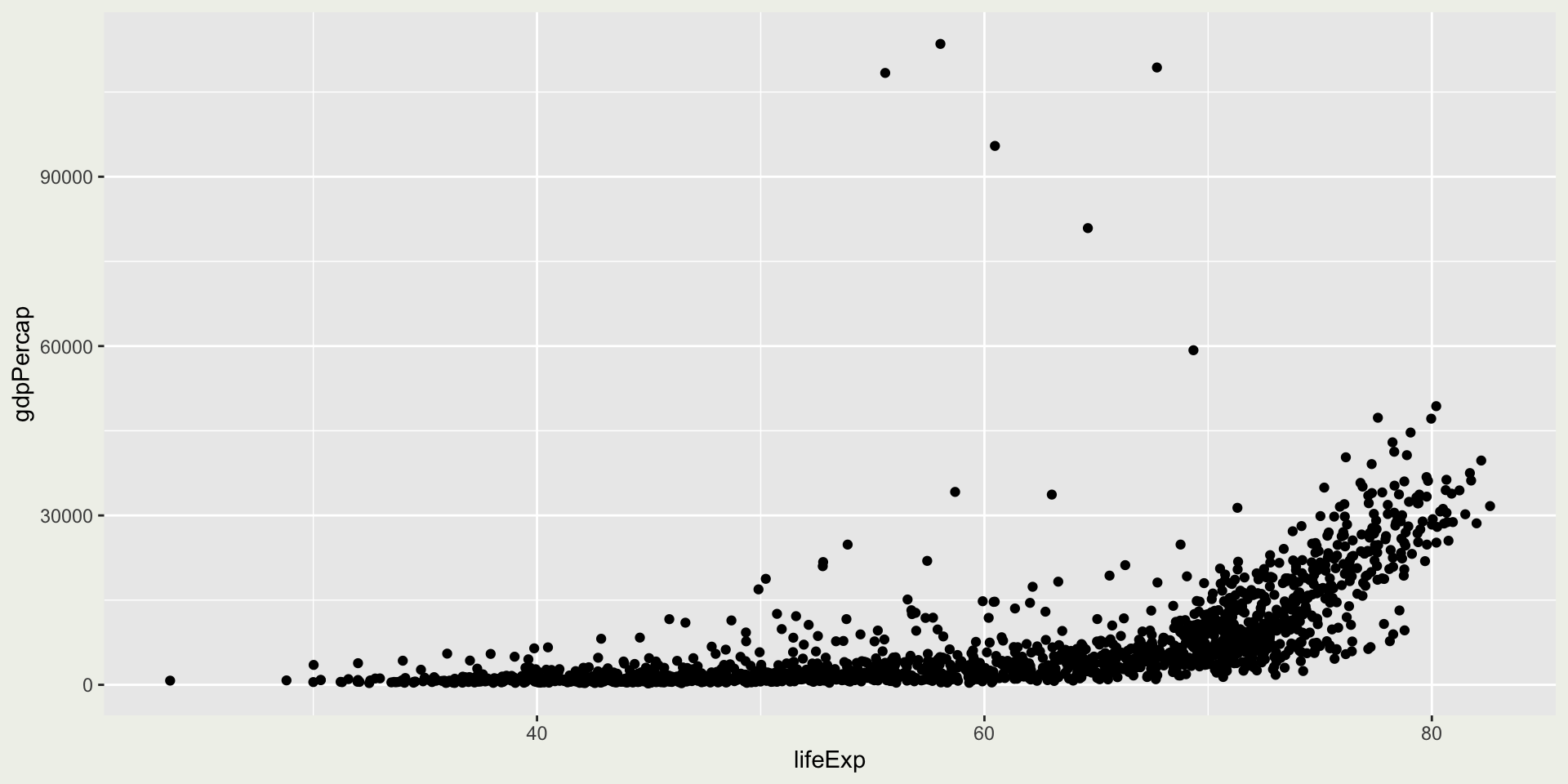
- Data:
gapminderdataset from thegapminderpackage - What are the variables mapped to the x and y axes?
- What is the geom used here?
Let’s build!
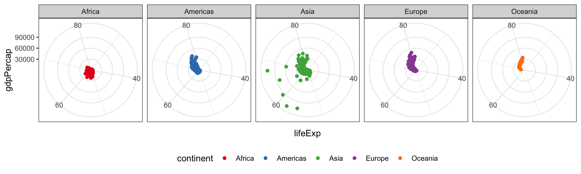
With the gapminder data, we want to create a ggplot(), we will be using geom_point() to create a scatter plot with the following aesthetics mappings:
lifeExpis mapped to the x-axisgdpPercapis mapped to the y-axis

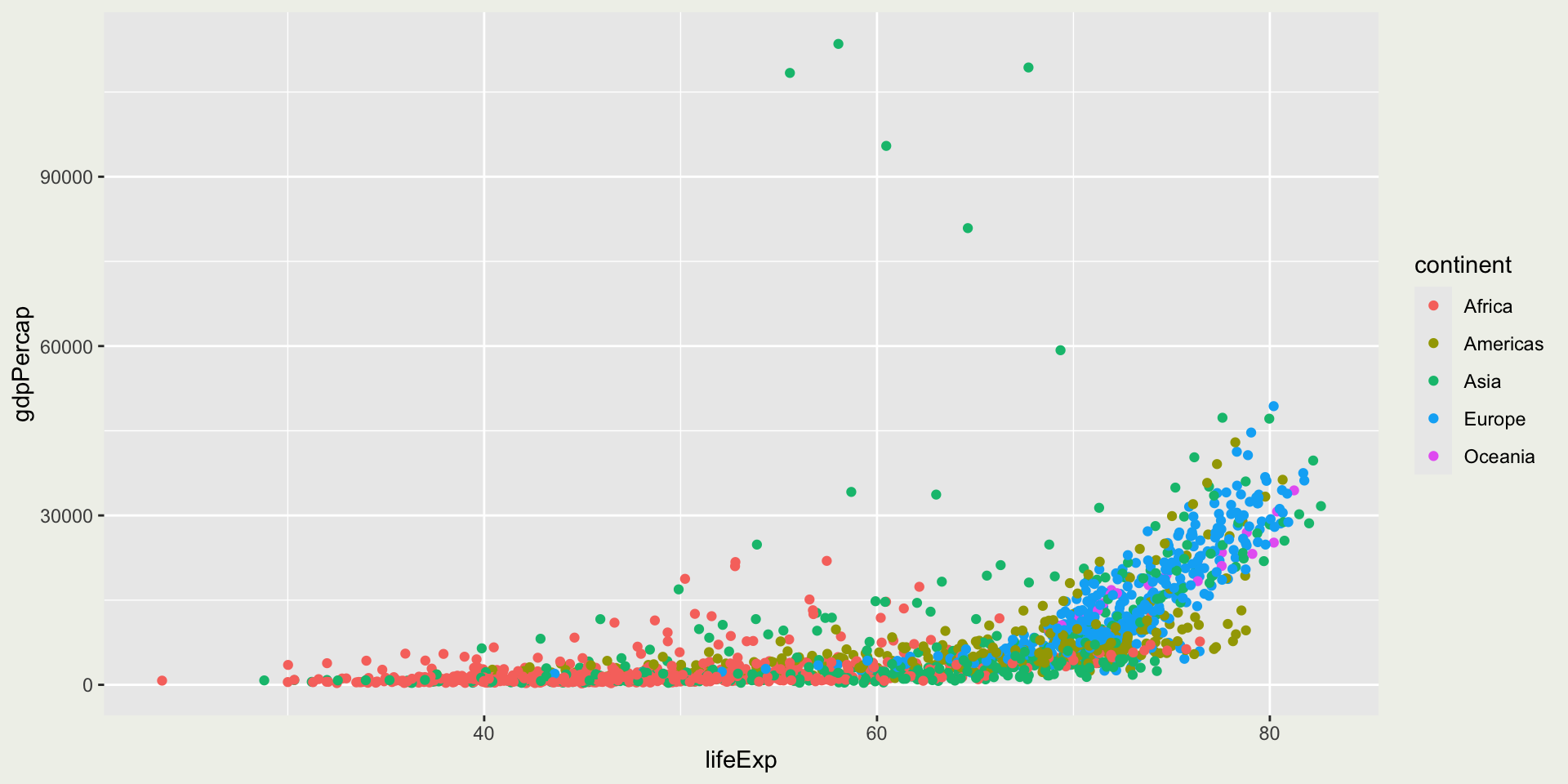
Can you color the points by continent?
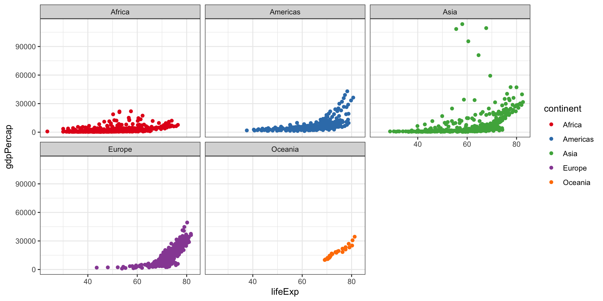
Can we use small multiples for continents?
Translate to ggplot language: facet by continent
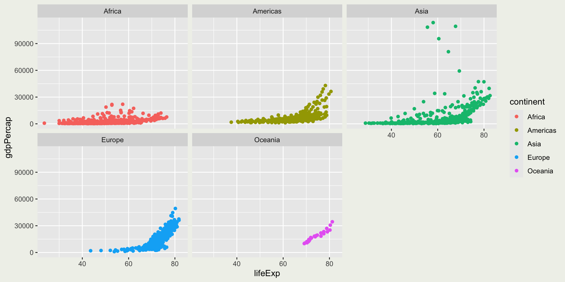
How many facets are there?
You will most likely only interact with two facets: 1) facet_wrap(vars(...), ...) for one variable and 2) facet_grid(... ~ ..., ...) for two variables.
But there are other fancy facets in the wild (ggplot2 extensions):
ggh4x::facet_nested()
geofacet::facet_geo() 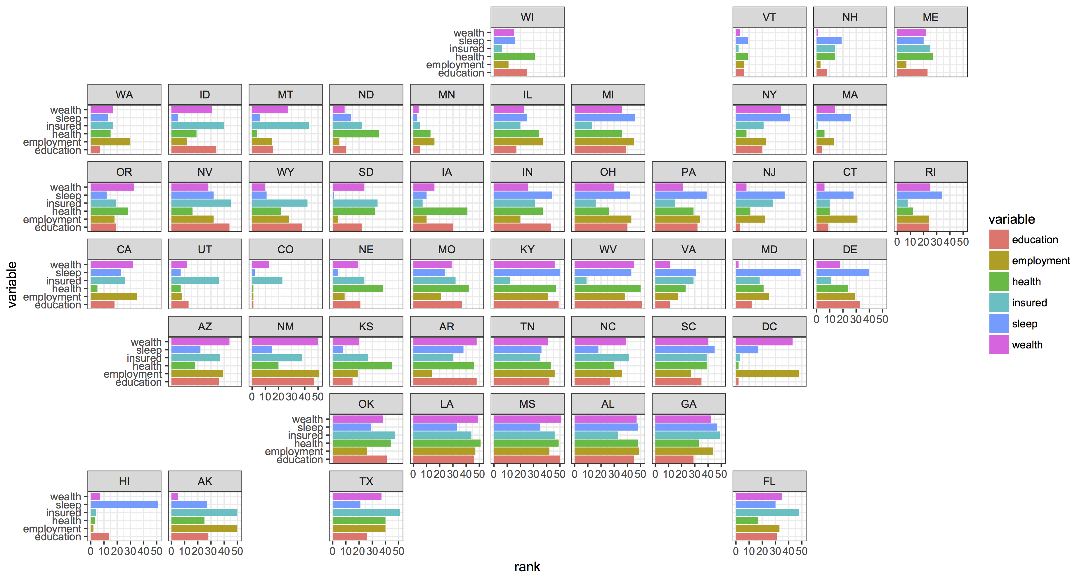
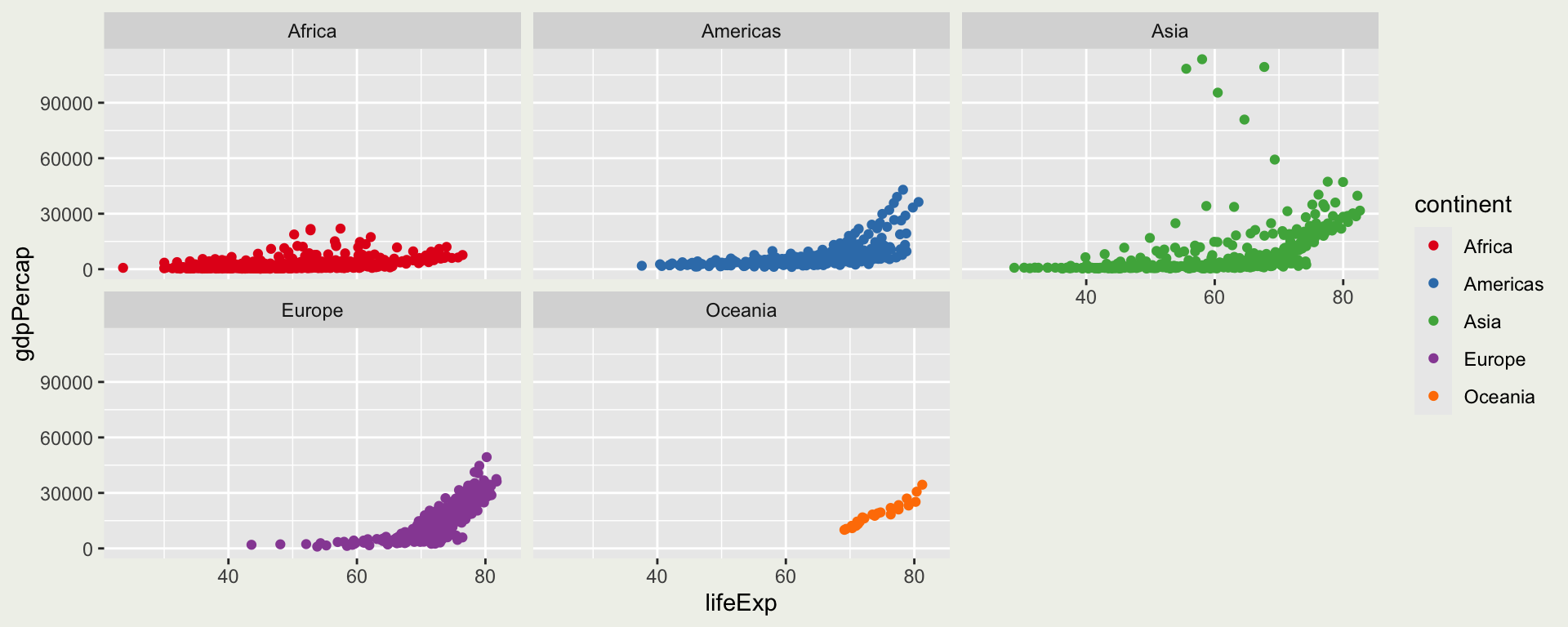
Can we use a different color palette?
Translate to ggplot language:
- use
scale_[color/fill]_[...](palette = "...")to change the color palette
Can we use a different theme?
Can we move around the legend?

How many themes are there?
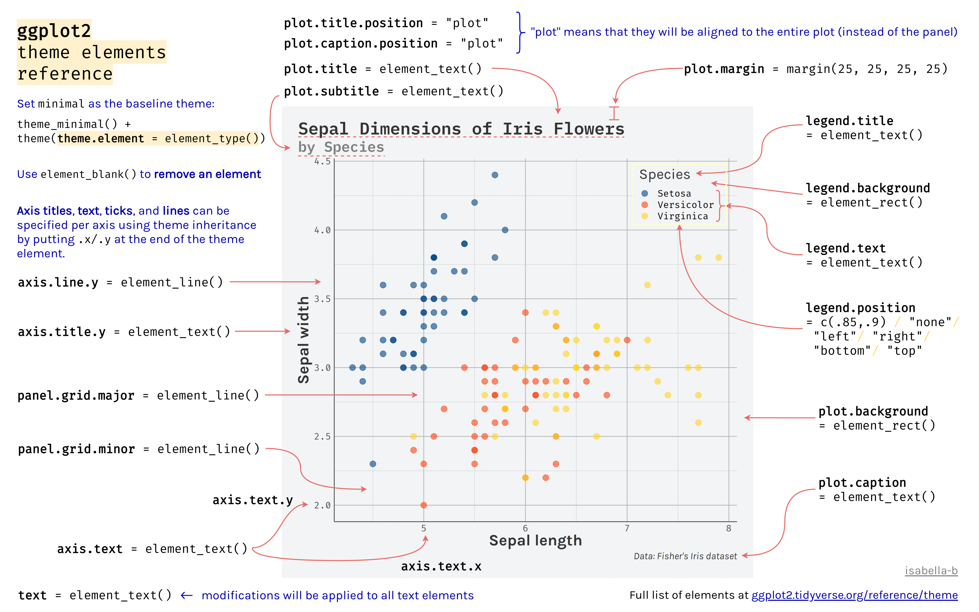
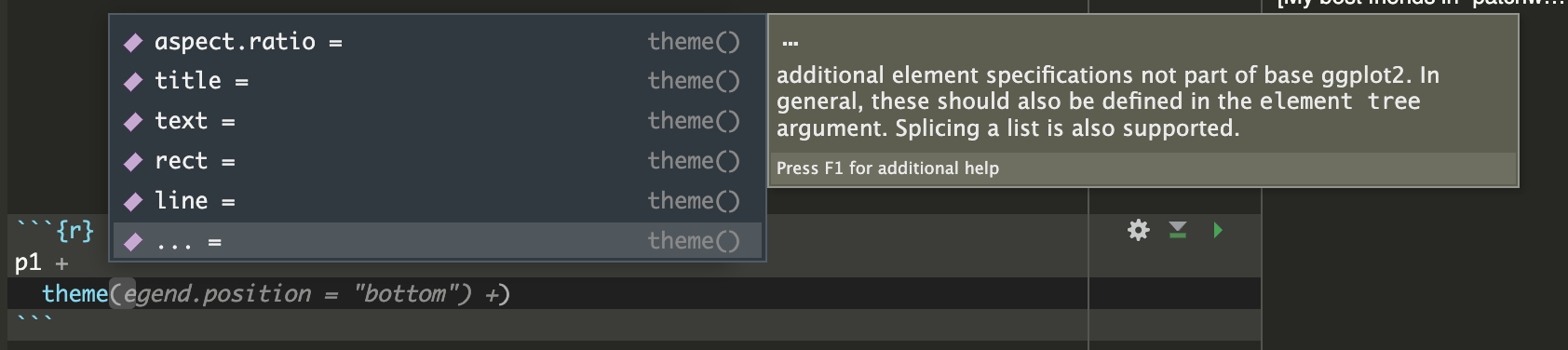
Please don’t memorize all these theme elements!
Instead, put your cursor inside theme() and press the Tab key on your keyboard to activate this popup list available theme elements:
Theme

Theme
p1 <- gapminder |>
  ggplot() +
  geom_point(aes(x = lifeExp, y = gdpPercap, color = continent)) +
  facet_wrap(vars(continent)) +
  scale_color_brewer(palette = "Set1") +
  theme_bw() +
  theme(legend.position = "bottom")
p1 +
# these are some useful ones
# remove unnecessary reference lines
theme(panel.grid.minor = element_blank())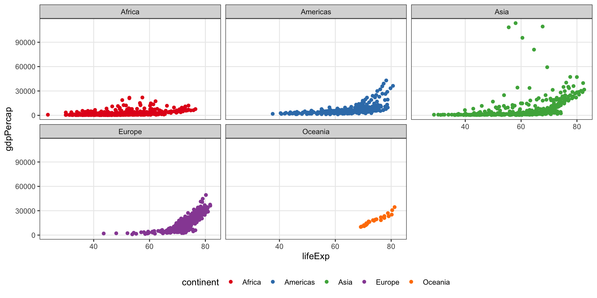
Theme
p1 <- gapminder |>
  ggplot() +
  geom_point(aes(x = lifeExp, y = gdpPercap, color = continent)) +
  facet_wrap(vars(continent)) +
  scale_color_brewer(palette = "Set1") +
  theme_bw() +
  theme(legend.position = "bottom")
p1 +
# these are some useful ones
# remove unnecessary reference lines
theme(panel.grid.minor = element_blank()) +
# larger text size for presentation
theme(text = element_text(size = 20))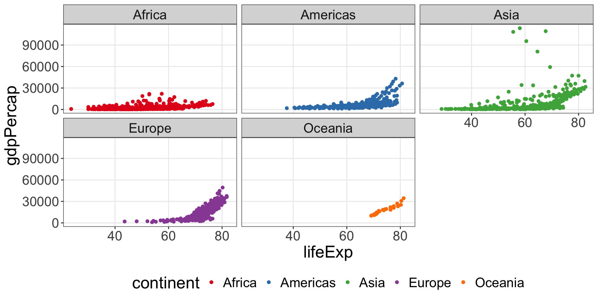
Theme
p1 <- gapminder |>
  ggplot() +
  geom_point(aes(x = lifeExp, y = gdpPercap, color = continent)) +
  facet_wrap(vars(continent)) +
  scale_color_brewer(palette = "Set1") +
  theme_bw() +
  theme(legend.position = "bottom")
p1 +
# these are some useful ones
# remove unnecessary reference lines
  theme(panel.grid.minor = element_blank()) +
# larger text size for presentation
theme(text = element_text(size = 20)) +
# now you can free solo
theme(legend.title = element_text(
family = "menlo", size = 30))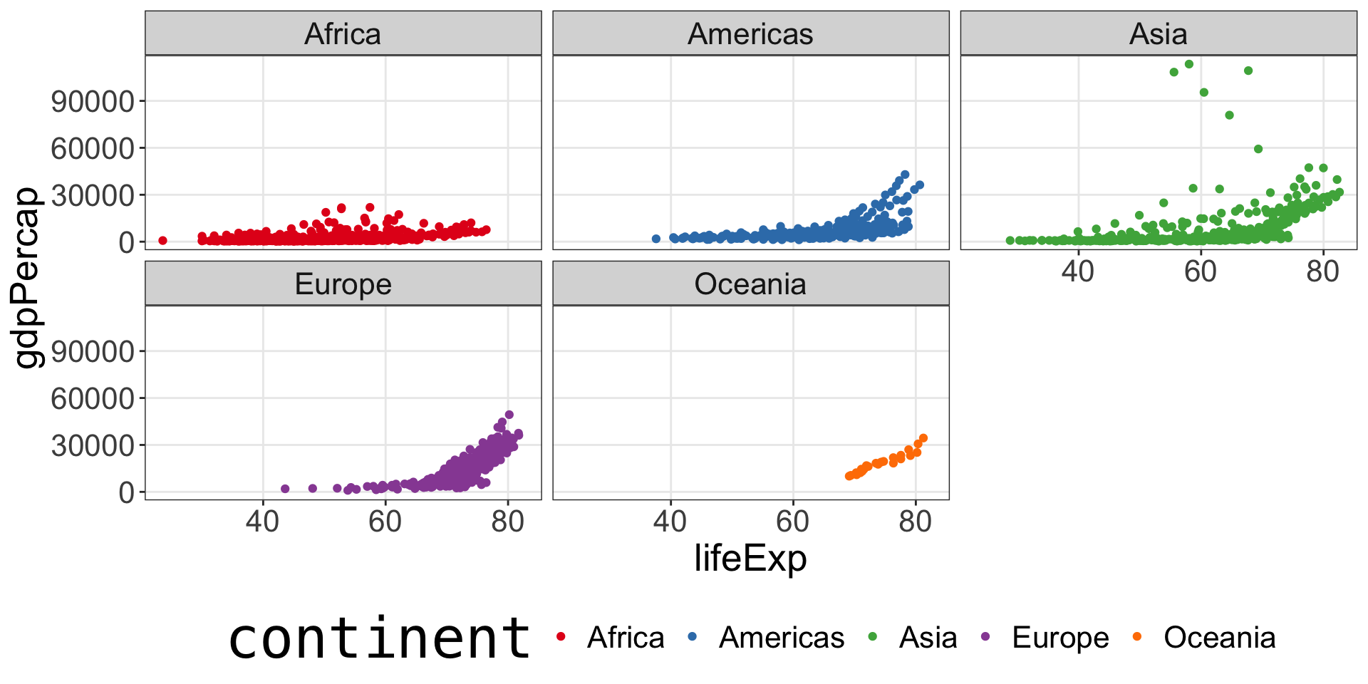
Theme
p1 <- gapminder |>
  ggplot() +
  geom_point(aes(x = lifeExp, y = gdpPercap, color = continent)) +
  facet_wrap(vars(continent)) +
  scale_color_brewer(palette = "Set1") +
  theme_bw() +
  theme(legend.position = "bottom")
p1 +
# these are some useful ones
# remove unnecessary reference lines
  theme(panel.grid.minor = element_blank()) +
# larger text size for presentation
  theme(text = element_text(size = 20)) +

# now you can free solo
  theme(legend.title = element_text(
family = "menlo", size = 30)) +
theme(panel.background = element_rect(
fill = "lightblue", color = "black"))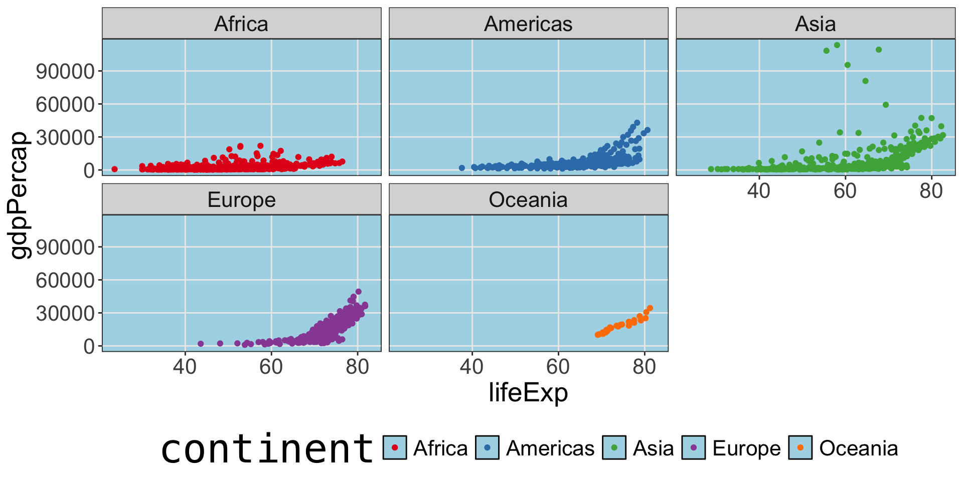
Theme
p1 <- gapminder |>
  ggplot() +
  geom_point(aes(x = lifeExp, y = gdpPercap, color = continent)) +
  facet_wrap(vars(continent)) +
  scale_color_brewer(palette = "Set1") +
  theme_bw() +
  theme(legend.position = "bottom")
p1 +
# these are some useful ones
# remove unnecessary reference lines
  theme(panel.grid.minor = element_blank()) +
# larger text size for presentation
  theme(text = element_text(size = 20)) +

# now you can free solo
  theme(legend.title = element_text(
    family = "menlo", size = 30)) +
  theme(panel.background = element_rect(
fill = "lightblue", color = "black")) +
theme(panel.grid = element_line(
color = "black", size = 2))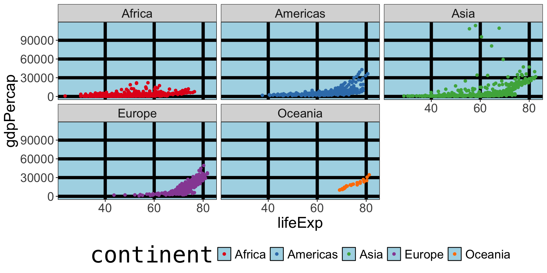
We haven’t talked about coordinates
Most likely you will only use coord_cartesian(), you may see coord_flip(), coord_polar(), or coord_sf() occasionally.
Your time
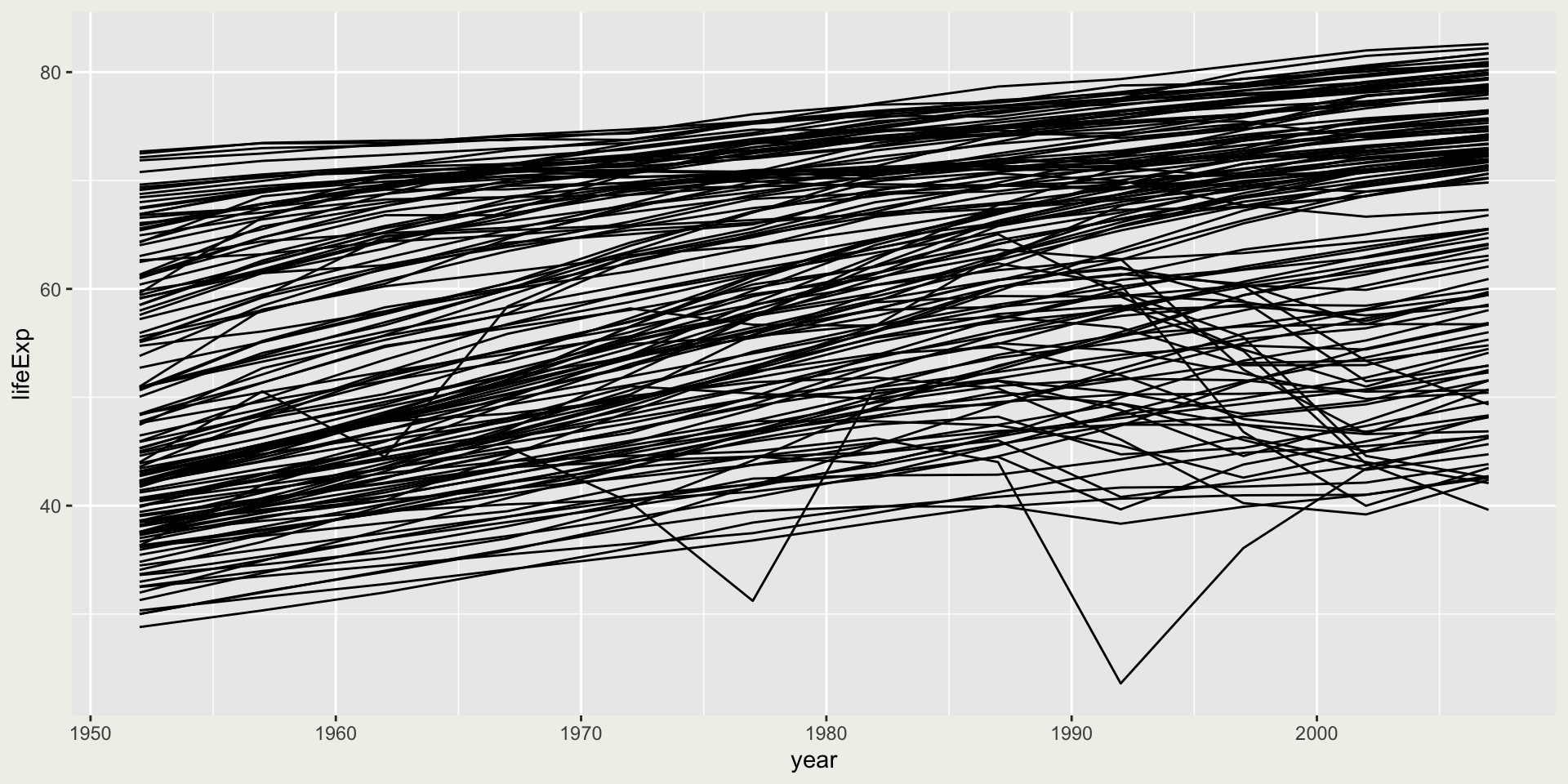
We will be practicing all these components with geom_line().
geom_line()needs agroupaesthetic to tell it how to connect the points.